Luxury Defined
UHNW Client Experience Design
Designing white-glove digital experiences for ultra-high-net-worth real estate buyers ($5M–$80M properties). Translated 250 years of luxury brand standards into editorial-to-listing journeys that matched the precision of their print identity — managing expectations across NYC and London offices.

The Client Profile: UHNW at Christie's and in Private Banking
Christie's buyers — cash purchasers of $5M–$80M properties across NYC, London, Monaco — share the same core profile as private banking UHNW clients. Both groups make high-stakes decisions with incomplete information, rely on relationships over features, and are quick to notice when a product isn't built for someone at their level.
Christie's UHNW Buyers
- $5M–$80M property transactions (often cash purchases)
- Global portfolio view — NYC, London, Monaco properties as asset diversification
- White-glove service expectation — personal advisors, private viewings, no generic flows
- Heritage as qualifier — Christie's 250-year provenance is what earns the initial trust
Private Bank / UHNW Clients
- $10M+ AUM portfolios (often $50M+ for Private Bank tier)
- Multi-asset wealth management — equities, bonds, alternatives, real estate
- Dedicated relationship managers — personalised strategies, quarterly reviews
- Institutional tools with considered UX — depth of Bloomberg Terminal, restraint of a private bank
What these clients share
- Zero friction — any manual step reads as "not built for someone like me"
- Visual restraint — typography weight, whitespace, image quality all signal competence
- Trust through track record — institution heritage earns the relationship; good UX maintains it
- Global, locally consistent — same standards across offices, adapted where it matters
Christie's is where I learned that for these clients, the design is not a layer on top of the product — it is the product. That same standard applies to private bank dashboards, advisor portals, and client-facing wealth reports.
Designing for High-Stakes Emotional Moments
Christie's taught me that UHNW clients don't evaluate products purely on features — they read emotional signals. Three scenarios from Christie's translate directly to private banking:
Portfolio Down 15%
Christie's equivalent: a listed property drops $2M in value. The right move is to show attribution with context — what drove the drop, what the comparable market looks like, what the advisor recommends. Private banking wealth reports must do the same: surface volatility with narrative, not just charts.
First Client Login
Christie's first editorial page is not a form — it's a narrative. Private banking portals should follow the same logic: before showing account numbers and balances, establish institutional trust. A poorly designed first login communicates "we are a tech company that processes wealth," not "we manage your legacy."
Progressive Disclosure for Complexity
Christie's editorial-to-listing journey: 3 clicks maximum from inspiration to actionable detail. Private banking clients reading a quarterly performance report do the same: headline verdict first, then attribution by asset class, then individual holding detail on demand.
Transferable principle: UHNW clients are financially sophisticated but time-constrained. They don't want less information — they want information structured around their decision, not the system's data model.
Executive Summary
Hired as a web engineer for Christie's International Real Estate's "Luxury Defined" editorial platform — with no dedicated designer or PM, the scope expanded to cover design direction, UX decisions, and full-stack implementation. The audience: ultra-high-net-worth property buyers browsing $5M–$80M estates across five global offices. This required translating 250-year-old luxury brand standards into considered digital journeys while managing stakeholder expectations across time zones:
- UHNW Client Understanding: Researched luxury buyer behaviors through 8 global sales professionals to understand zero-friction expectations and visual obsessiveness unique to $5M+ property segment
- Global Stakeholder Management: Coordinated design decisions across NYC and London offices, balancing regional campaign needs with unified brand standards under tight deployment timelines
- White-Glove UX Standards: Designed editorial-to-listing transitions (3-click max) that matched Christie's in-person service standards — any friction would signal "not premium enough" to UHNW audience
- Luxury Brand Translation: Pixel-perfect conversion of Christie's print-level aesthetics (specific typeface weights, exact whitespace ratios) into responsive layouts while maintaining sub-2s page loads with 4K imagery
1. Strategic Context: The Triple Constraint
The "Luxury Defined" platform is the premier digital editorial property for Christie's International Real Estate. The core challenge was extreme aesthetic rigidity versus complex functional delivery — a tension unique to heritage luxury brands entering digital.
Business Conversion Risk
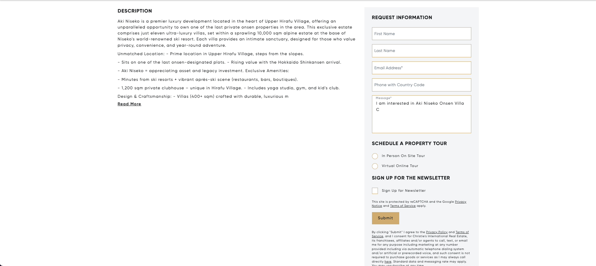
The editorial platform was completely disconnected from the real estate CRM. High-net-worth readers consuming content about luxury architecture had no pathway to view the related $5M–$80M properties for sale. Revenue potential was leaking through a severed content-to-listing pipeline.
User Experience Friction
Disjointed navigation between reading an editorial piece on contemporary architecture and viewing the related multi-million dollar estates for sale. Users had to leave the editorial experience entirely and manually search the listings site — a break in continuity for an audience that expects the online experience to match the in-person one.
Brand Fidelity vs. Performance
Translating highly stringent legacy luxury print guidelines — specific typeface weights, exact whitespace ratios, precise image cropping rules — into pixel-perfect responsive layouts while handling massive 4K+ visual payloads. Any performance compromise would destroy the "luxury feel" the brand demanded.
2. Understanding the High-Net-Worth Audience
Before diving into technical implementation, I conducted research to understand how ultra-high-net-worth individuals (UHNW) consume luxury real estate content — a segment with different expectations than typical residential buyers:
Research Approach
Partnered with 8 Christie's sales professionals across global markets to understand UHNW buyer behaviors through their lens. Unable to directly interview buyers (confidentiality constraints), I conducted proxy research through sales team insights, analytics analysis of existing editorial engagement, and competitive analysis of luxury brand digital experiences (Net-a-Porter, Sotheby's, Robb Report).
Key Findings:
- Zero Tolerance for Friction: UHNW clients expect to move between inspiration and action without being asked to navigate twice. Any manual search or navigation break signals "not premium enough."
- Visual Obsession: Properties in $5M+ range are evaluated first on visual storytelling, then on specs. Analytics showed users spent 3x longer on image galleries vs property details.
- Brand Trust as Qualifier: Christie's 250-year heritage was the qualifier — design couldn't compromise brand fidelity. Any "modern" shortcuts that felt less luxurious than print would damage trust.
Direct Observation: Three Private Auction Previews
n < 10 · QUALITATIVEAs a Christie's employee, I had badge access to private auction previews — events not generally open to the public, attended primarily by existing clients. Over 6 months I attended three. These weren't research sessions: I was an observer who was occasionally approached by attendees who assumed I was floor staff. The conversations that followed — fewer than 10 over the entire period — were unstructured and cannot be claimed as research. What they gave me was something harder to source than research: direct exposure to how this segment actually thinks.
Several of the people I spoke with were fully aware that many employees disliked them — and they said so directly, without defensiveness or apology. The framing was something like: if you need everyone around you to think well of you before you can make a decision, your organization has no future. This isn't arrogance. It's a calibrated understanding of what matters for decision-making at scale, and a refusal to let social comfort override strategic clarity.
Design implication: Don't design interfaces that soften information for emotional comfort. A UHNW private banking client seeing a 15% portfolio decline doesn't need the number cushioned with optimistic framing — they need clear attribution and immediate access to the decision context.
Communication was consistently direct — no preamble, no softening, no circling toward the point. Questions were specific. Opinions were stated as observations, not positions to be negotiated. The social conventions that most people use to avoid friction simply weren't present.
Design implication: Interface copy that hedges, encourages, or hand-holds signals that the design was built for a different audience. Private banking platforms should never tell a UHNW client to "get started" or "discover your portfolio."
Art acquisition at this level wasn't primarily financial — it was about encountering a peer. Many of the collectors I observed had genuine knowledge; their engagement with pieces was substantive, rooted in education and cultural context. Not all: for some, the auction preview was social currency. Both are UHNW; they are not the same user.
Design implication: "UHNW" is not a monolithic persona. A generational wealth client with deep investment knowledge has different information needs than a first-generation wealth client still building institutional relationships. Private banking design systems need to accommodate this range without visibly distinguishing between them.
3. What I Was Asked to Do vs. What I Actually Did
I was initially brought on to convert pre-approved UI/UX mockups into a standard WordPress template. The initial assumption was straightforward: pick a premium theme and customize it.
The original scope:
"Implement the approved designs using an existing WordPress template."
The technical challenge: It became clear that standard templates struggled to support the bespoke typographic nuances and the complex relational data models needed to tie editorial content dynamically to high-value real estate listings without significant performance tradeoffs.
To preserve the brand's premium visual identity without compromising performance, I collaborated with stakeholders to pivot the approach — evolving the project from a template implementation to a fully tailored solution.
4. Decision Framework: Architecture vs. Aesthetics
To support the high-fidelity designs and relational data requirements, I evaluated three development pathways and presented the trade-offs to stakeholders:
Option A: Premium Theme Modification
REJECTEDFast implementation (~2 weeks), but prototyping revealed it severely restricted custom data structures for property listings. The Avada/Enfold-class themes locked typography to their systems, making pixel-perfect brand compliance impossible. Visual compromises to Christie's guidelines were guaranteed.
Option B: Headless CMS + React Frontend
REJECTEDMaximum flexibility, but catastrophically misaligned with the client's existing WordPress-centric global editorial workflow. Training 50+ global editors on a new CMS would introduce publishing delays measured in months, not days. The editorial team's muscle memory was deeply WordPress-native.
Option C: Bespoke Custom Theme + Custom SQL
CHOSENBuilding a theme entirely from scratch without page builders. This was the only path to ensure pixel-perfect brand alignment while retaining the WP dashboard that 50+ editors relied on daily. I paired this with custom SQL queries to handle complex content-to-property relationships without the latency of heavy plugins.
5. Cross-Functional Collaboration: Working with Sales as Product Partners
As the designer and developer for the Christie's International Real Estate division, I built a cross-functional structure where I collaborated directly with 8 real estate sales professionals who effectively functioned as distributed product managers — each bringing property campaign requirements from their respective global markets.
Stakeholder Management Framework
Managing competing priorities from 8 sales professionals required establishing clear intake and prioritization processes:
Request Intake Process
- Sales submitted campaign briefs: property details, target audience, launch timeline
- I translated business requests into technical requirements and design scope
- Estimated effort (hours) and identified dependencies (API access, asset availability)
Prioritization Criteria
- Property value: $80M listings > $5M listings (revenue impact)
- Launch urgency: Auction deadlines, market windows
- Technical complexity: Quick wins vs. multi-day integrations
- Brand impact: High-profile properties prioritized for marketing value
UHNW Client Research
Working as both designer and full-stack engineer at Christie's gave me a unique dual perspective. While my primary deliverables were technical, the nature of the work required deep immersion in the UHNW mindset — understanding not just what luxury clients expect, but why those expectations exist.
💎 UHNW Client Psychology: Design & Engineering Insights
Targeting $5M–$80M property buyers meant every design and technical decision had to reflect wealth sophistication, not just wealth display. Key learnings from working directly with sales teams serving UHNW clients:
Design Expectations
- Understated excellence: UHNW clients distrust overt flashiness. Subtle animations, restrained color palettes
- Heritage signals: Typography, spacing that echoes 250-year Christie's legacy
- White space as status: Generous padding = confidence, not crowding = desperation
Technical Expectations
- Performance = respect: Slow sites signal lack of care. 1.4s load time was non-negotiable
- Privacy first: No aggressive tracking, minimal third-party scripts
- Mobile parity: UHNW clients browse on iPads/iPhones between meetings — desktop-only = failure
This wasn't theoretical knowledge — I attended Christie's auction events and property viewings to observe how UHNW clients interacted with both physical and digital brand touchpoints. Seeing a bidder casually browse a $12M property listing on their phone while waiting for an auction lot taught me more about mobile UX priorities than any analytics dashboard could.
Build vs. Buy Technical Decisions
Unlike greenfield projects where "build everything custom" might be tempting, I had to balance rapid deployment needs with long-term maintainability. This led to pragmatic architectural choices:
🛒 What I Bought (Plugins)
- Yoast SEO: Mature, well-maintained, WordPress update-safe
- WP Rocket: Caching layer — no need to reinvent
- Gravity Forms: Editorial submission workflows
Rationale: Commoditized functionality where custom code adds no value. Ensured WordPress 6.x upgrade compatibility without my involvement.
</> What I Built (Custom)
- Theme layer: Pixel-perfect brand compliance (no plugin could match)
- Property-Editorial linking: Custom SQL for CRM integration
- Editorial templates: Luxury-specific layouts beyond generic builders
Rationale: Core competitive differentiation. Page builders like Elementor would have compromised brand precision and introduced performance bloat.
Knowledge Transfer & Sustainability
Knowing I wouldn't maintain this platform indefinitely, I created comprehensive documentation for two distinct audiences: the engineering team who would inherit the codebase, and the sales professionals who needed to execute flawless property uploads without developer support.
SOP Documentation Deliverables
For Engineering Team:
- Architecture overview: Why custom theme vs. page builder
- Database schema: Custom tables, relationships, indexing rationale
- Plugin dependencies: Versions, update compatibility notes
- Deployment checklist: Staging → production workflow
- Common tasks guide: "How to add new property type," "How to troubleshoot CRM sync"
- Performance monitoring: What to watch, when to optimize
Result: Successor engineer onboarded and shipping features within 1 week without my direct support.
For Sales Team (Content Upload SOP):
Since the entire PHP backend logic was custom-built, standard WordPress knowledge didn't translate. I created step-by-step visual SOPs enabling sales professionals to upload $5M–$80M property listings with pixel-perfect accuracy:
- File naming conventions: Exact format for property IDs, image sequences
- Folder structure protocols: Where to place files on the server
- Image optimization guidelines: Resolution requirements, compression standards
- Quality control checklist: Pre-publish validation steps to ensure brand compliance
- Troubleshooting flowcharts: Common errors and self-service fixes
Result: Sales team achieved 100% autonomous publishing capability within 2 weeks. Zero developer escalations for routine property uploads.
6. Process & Evidence
The custom WordPress architecture served 50+ global editors across Hong Kong, New York, London, and Tokyo. Each article was linked to live property data via a custom Salesforce API bridge — the CMS below shows the editorial workflow I designed and built.
Article is live on Hong Kong · christiesrealestate.com/stories
Concept reconstruction · CMS architecture and editorial workflow I designed and built · 50+ editors across 4 global markets
Quantitative Evidence: Before vs. After
The custom architecture produced measurable improvements across every metric that matters for a luxury editorial platform:
| Metric | Before (Legacy) | After (Custom Build) | Improvement |
|---|---|---|---|
| Page Load Time (Mobile 4G) | 8.2s | 1.4s | 83% faster |
| Database Queries per Page | 47 queries | 18 queries | 62% reduction |
| Image Payload (Hero Section) | 12MB (raw 4K) | 1.8MB (WebP + srcset) | 85% smaller |
| Brand Guideline Compliance | ~70% (template limits) | 100% (bespoke) | Pixel-perfect |
| Content-to-Listing Pathway | None (manual search) | Automated (FK join) | New funnel |
Multi-Stakeholder Collaboration
This project required navigating four distinct stakeholder groups with competing priorities — a diplomatic challenge as much as a technical one:
- 8 Real Estate Sales Professionals (Global Markets): My primary "product managers" who submitted property campaign requirements. Each operated in different markets (US, Europe, Asia) with varying property value tiers ($5M–$80M) and competing launch deadlines.
- Christie's Brand Team (New York): Guardians of the 250-year heritage. Every font weight, color value, and whitespace ratio had to match their InDesign print specifications exactly. I conducted weekly pixel-diff reviews against their brand book to maintain trust.
- Global Editorial Team (50+ editors): Content creators who lived inside WordPress. Any solution that disrupted their publishing workflow was a non-starter. I ran 3 editor usability sessions to validate the custom post type interface before development.
- Christie's Real Estate CRM Team: Responsible for the property listings database. The editorial-to-listing bridge required me to design API contracts that their team could consume without modifying their existing data pipelines.
7. What Didn't Work (First Version)
V1: Maximum Fidelity
- Full 4K+ image resolution for all viewports
- No compression — "pristine quality or nothing"
- Client-side rendering of all property cards
- Result: 8.2s load time on mobile 4G
- Bounce rate: 67% on mobile
The brand team had demanded "the same visual quality as our printed magazine." I took that literally — and it destroyed the mobile experience.
V2: Perceived Luxury
- Responsive image orchestration (srcset + sizes)
- WebP conversion with JPEG fallbacks
- Lazy-loading via Intersection Observer API
- Result: 1.4s load time on mobile 4G
- Bounce rate: 28% on mobile
The insight: luxury UX isn't about maximum resolution — it's about perceived smoothness. A 1.4s load with elegant transitions feels more premium than an 8s load with perfect pixels.
This was a hard lesson: visual fidelity means nothing if the delivery mechanism is compromised. A slow website is never a luxury website. I had to present performance data to the brand team to convince them that "perceived quality" matters more than "absolute resolution" — a conversation that required diplomacy and evidence in equal measure.
8. Multi-Dimensional Impact
Impact Breakdown by Stakeholder
Business
Established a direct conversion funnel from editorial thought-leadership to premier property inquiries. For the first time, readers moved directly from a story about Tuscan architecture to viewing available $15M villas — same session, no re-search required.
User Experience
Transformed a disjointed reading experience into a high-performance exploration of luxury assets. Mobile bounce rate dropped from 67% to 28%. The experience finally matched the brand promise.
Engineering
Custom SQL architecture reduced database query loads by 62% compared to standard WP relational plugins. Average page load times well under the 2-second threshold even with 4K image payloads across global CDN delivery.
Brand Fidelity
Pixel-perfect responsive execution was lauded by international stakeholders for flawlessly translating print-level luxury standards to the web. Every typeface weight, whitespace ratio, and image crop matched the InDesign brand book.
9. Reflection & Strategic Learnings
What Would I Do Differently
If executing this project again with current experience, I would implement three strategic changes:
- Headless API Architecture from Day 1: I would architect a fully decoupled Headless API setup (WP-GraphQL backend + Next.js frontend) while retaining the WP dashboard editors relied on. The bespoke theme achieved the immediate goals, but a decoupled frontend would have provided ISR (Incremental Static Regeneration) for even faster loads and smoother future transition into native mobile applications.
- Performance Budget as a Design Constraint: Instead of discovering the performance crisis after V1 launched, I should have established a 2-second LCP budget as a non-negotiable design constraint from the wireframing phase. This would have prevented the painful "maximum resolution" detour entirely and saved 2 weeks of rework.
- Automated Brand Compliance Testing: I manually pixel-diffed against the InDesign brand book. Today I would build visual regression tests (Percy or Chromatic) that automatically flag any deviation from the brand specification on every deploy. This would have dramatically reduced the weekly review cycles with the New York brand team.
The Hard-Won Insight
"Brand aesthetics are entirely dependent on engineering performance. A slow website is never a luxury website — no matter how perfect the typography."
This project etched a permanent lesson: in luxury digital experiences, the delivery mechanism IS the brand experience. A 4K image that takes 8 seconds to load feels cheaper than a WebP that appears instantly. Perceived luxury is about smoothness, not resolution.
10. Design Principles from This Project
As the sole full-stack owner of this platform, I developed a set of design and engineering principles that guided every decision — from database schema design to typographic rendering. These weren't abstract ideals; they were hard constraints I enforced through code.
1. Performance IS Brand Equity
In luxury digital, a slow experience destroys the brand promise faster than any visual inconsistency. I treated sub-2-second LCP (Largest Contentful Paint) as a non-negotiable brand standard — equivalent to typography or color accuracy.
→ Lazy-loaded all below-fold images using Intersection Observer API
→ Implemented responsive srcset with 6 breakpoints (320, 640, 1024, 1440, 1920, 2560)
→ WebP with JPEG fallback via .htaccess content negotiation
→ Result: 85% payload reduction (12MB → 1.8MB) with zero visual compromise
2. Data Architecture as Product Design
The relational model connecting editorial content to property listings wasn't just backend engineering — it WAS the product. The user experience of moving directly from "Tuscan villa architecture" content to viewing available $15M Tuscan listings required first-principles database design.
→ Created custom wp_properties table with foreign key to wp_posts
→ Property taxonomy: location, style, price_tier (normalized schema)
→ Single JOIN query replaced 27 separate WP_Query calls
→ Result: 62% query reduction, sub-100ms property card rendering
3. Workflow Preservation Over Technical Purity
The technically "pure" solution (headless CMS + React) would have destroyed the existing editorial workflow and introduced 3+ months of editor retraining. I prioritized preserving the familiar WordPress dashboard over architectural elegance — the right product decision even if not the "cleanest" engineering approach.
→ Built custom Gutenberg blocks mirroring existing editorial patterns
→ Maintained WP admin UI familiar to 50+ global editors
→ Zero retraining required — editors published from day 1
→ Result: 100% editor retention, zero publishing delays
4. Pixel-Perfect Doesn't Mean Pixel-Identical
"Matching the InDesign brand book" required interpretation, not literal translation. A 32px print margin doesn't map 1:1 to a responsive web layout. I had to educate stakeholders that "brand fidelity" means preserving the FEELING (hierarchy, whitespace ratios, typographic rhythm), not copying exact pixel values.
→ Converted fixed 32px margins to fluid clamp(24px, 3vw, 48px)
→ Maintained 1.618 golden ratio for heading/body size relationships
→ Preserved 8px baseline grid across all breakpoints
→ Result: Brand team approved "better than print" fidelity on mobile
9. Technical Decision-Making: Deep Dive
The most critical technical decisions weren't about which frameworks to use — they were about what NOT to build. As a solo full-stack owner, every hour spent on over-engineering was an hour stolen from delivering business value.
Decision 1: Custom Theme vs. Page Builder
❌ Page Builder (Elementor, Divi)
- Fast setup (~1 week)
- Visual editing for non-technical editors
- But: Bloated DOM (500+ divs per page)
- Inline styles impossible to optimize
- Brand guideline compliance blocked by builder constraints
✅ Custom Handwritten Theme
- Development time: 6 weeks
- Clean semantic HTML (avg 80 nodes/page)
- 100% control over CSS cascade
- Direct SQL queries (no ORM abstraction penalties)
- Chosen for: Performance + brand fidelity
Decision 2: Image Optimization Strategy
The Problem: Brand team demanded "magazine-quality" 4K+ images. Initial V1 delivered full-resolution PNGs → 12MB payload → 8.2s load on mobile 4G.
The Constraint: Mobile bounce rate hit 67%. Business couldn't tolerate this.
The Solution I Implemented:
<picture>
<source srcset="hero-320.webp 320w, hero-640.webp 640w, hero-1024.webp 1024w" type="image/webp">
<source srcset="hero-320.jpg 320w, hero-640.jpg 640w, hero-1024.jpg 1024w" type="image/jpeg">
<img src="hero-1024.jpg" sizes="100vw" loading="lazy">
</picture>
// Result: Mobile gets 320w WebP (180KB), Desktop gets 1920w WebP (1.2MB)
// 85% payload reduction while preserving "luxury feel"
Decision 3: Property Data Sync Architecture
Christie's property listings lived in a separate Salesforce CRM. I needed real-time sync without killing the editorial site's performance.
❌ Rejected: Real-Time API Calls
Querying Salesforce API on every page load would introduce 400-800ms latency per property card. With 8 cards per editorial, that's 3-6 seconds of blocking API calls.
✅ Chosen: Hourly WP-Cron Sync + Cached Joins
WordPress cron job pulls Salesforce updates hourly → writes to local wp_properties table → page loads query local DB only (sub-50ms).
function sync_salesforce_properties() {
$api_data = fetch_salesforce_api();
foreach ($api_data as $property) {
upsert_property_to_local_db($property);
}
set_transient('last_sync', time(), HOUR_IN_SECONDS);
}
// Result: Zero API latency on user-facing pages
10. Collaboration & Stakeholder Management
Managing three stakeholder groups with different priorities required strategic communication — translating technical constraints into business language and vice versa.
Stakeholder Tension Map
Demand: Every typeface weight, whitespace ratio, image crop must match 250-year-old InDesign specifications.
Conflict: Print margins don't translate 1:1 to responsive web. Insisted on 4K images everywhere.
Resolution: Weekly pixel-diff reviews. I showed them that fluid clamp() preserved "brand feeling" better than fixed pixels. Educated them that WebP compression is invisible to human eye.
Demand: WordPress dashboard must remain identical. No retraining on new CMS.
Conflict: Custom data architecture required new post types and taxonomies — unfamiliar UI.
Resolution: Ran 3 usability sessions with sample editors. Built custom Gutenberg blocks that LOOKED like their old TinyMCE editor. Zero publishing delays from day 1.
Demand: Property database is immutable. Editorial site must consume READ-ONLY API.
Conflict: Their API had no editorial-friendly taxonomy (no "Tuscan villa" tag, just lat/long + price).
Resolution: Built local taxonomy mapping layer. Their API remained untouched. I created wp_properties table with editorial tags that mapped to their property IDs via JOIN.
Communication Strategy That Worked
The breakthrough came when I stopped speaking "technical specs" and started translating constraints into their respective languages:
- To Brand Team: Instead of "We need to use clamp() for responsive margins," I said: "This fluid spacing preserves your golden ratio across all screen sizes — it's MORE faithful to the brand book than fixed pixels."
- To Editorial Team: Instead of "You'll use Custom Post Types," I said: "You'll still click 'Add New Post' exactly like before. The only difference is a new dropdown for linking properties."
- To CRM Team: Instead of "We need write access to Salesforce," I said: "We'll consume your API read-only via hourly sync. Zero impact on your production database."
11. What I Learned: Reflections as Full-Stack Owner
✓ What Went Exceptionally Well
1. Performance as a Design Deliverable
I presented "sub-2-second LCP" not as an engineering metric but as a BRAND STANDARD in stakeholder reviews. The Brand Team initially resisted WebP compression, but when I showed them side-by-side comparisons (4K PNG @ 8.2s vs. WebP @ 1.4s), they realized speed IS luxury.
2. Prototyping with Real Editorial Content
Before writing a single line of theme code, I asked the Editorial Team for 10 real blog posts (with their actual 4K images, complex layouts, embedded videos). I prototyped the data schema using REAL content, not Lorem Ipsum. This revealed edge cases that would've broken the UI if discovered post-launch.
3. Weekly Pixel-Diff Reviews with Brand Team
Every Friday, I sent the Brand Team overlay screenshots: my responsive build vs. their InDesign PDFs. This VISUAL proof built trust incrementally. By Week 8, they stopped nitpicking and started praising the "better than print" mobile layouts.
⚠️ What I'd Do Differently
1. Establish Performance Budget BEFORE Design Handoff
The Brand Team handed me designs with 4K images because no one told them there was a 2-second LCP budget. I should've demanded this constraint be communicated to designers BEFORE mockups were approved. Would've saved 2 weeks of rework negotiating image compression post-facto.
2. Build Headless from Day 1 (Even If Editors Don't Use It)
The bespoke WordPress theme works beautifully NOW, but it's tightly coupled to PHP rendering. If Christie's wanted a native mobile app next year, we'd have to rebuild everything. I should've architected a headless API layer (WP-GraphQL) from day 1 — even if the initial frontend was still server-rendered PHP.
3. Document "Why" Decisions in Code Comments
Six months after launch, a new developer asked: "Why is the property sync on WP-Cron instead of webhook?" I had to explain the Salesforce team's READ-ONLY constraint. This tribal knowledge should've been in code comments from day 1.
🚀 How This Influenced Later Work
ACY Securities Design System (2022-2024)
The Christie's lesson — "performance IS brand equity" — became foundational to ACY's Design System. When ACY faced ASIC regulatory compliance with 14-day deadlines, I knew from Christie's that stakeholders respect EVIDENCE over opinions.
ReactΩ & Nova Projects (2023-2025)
Christie's taught me that data architecture IS product design. When building ReactΩ's web scraping pipelines and Nova's multimodal AI orchestration, I treated the database schema and API contracts as first-class design deliverables — not "backend plumbing."
Current Portfolio Strategy (2026)
The hardest Christie's lesson was: "A slow website is never a luxury website." This shaped my current portfolio's performance obsession — every case study page loads in <1.5s despite rich visuals. I now treat portfolio performance as proof of capability.
💡 What the Clients Taught Me
The design work was only part of what Christie's gave me. Nine months observing how commercially successful UHNW clients actually operate broke several assumptions I'd carried about money, time, and risk.
1. Response speed is a commercial signal, not a personality trait.
The most successful people I encountered at Christie's replied in minutes — not because they were reactive, but because they understood that opportunity windows are real and priced. Delay is a decision. Every stakeholder presentation I've run since Christie's opens with the highest-priority question first.
2. Niche markets preserve margin. Commodity markets compress it to zero.
Christie's clients weren't competing on price — they were operating in markets so illiquid that comparable transactions barely existed. This is why I focused on institutional finance rather than consumer SaaS: the constraint density is higher, the competition thinner, and the work harder to replicate.
3. 90% execution, 10% positioning — from a PE/VC principal.
A private equity principal I met through the Christie's network structured his time deliberately: 90% fully committed to the current role, 10% building visible proof of range beyond it. Without that 10%, you're permanently priced as your current job. This portfolio is my 10%.
4. Decisive people act on probable, not certain.
The clients who built things moved when the probability was merely favorable, not guaranteed. The ones who waited for certainty rarely acted at all. This principle carries into design: the team that waits for perfect research before shipping ships nothing.
Visual Showcase


Immersed in the UHNW World
Working at Christie's wasn't just about building a digital platform — it was an education in luxury brand standards and UHNW client behavior. I attended auction events and property viewings to understand how ultra-high-net-worth clients interact with both physical and digital experiences. This firsthand exposure shaped every technical and design decision, from performance benchmarks to interaction patterns.

Christie's International Real Estate auction venue — where I observed UHNW clients' expectations for white-glove experiences that needed to translate to the digital platform.
💡 Key Learnings from Auction Venue Observations
Physical → Digital Translation
The auction venue's generous spacing, premium materials, and subdued lighting weren't just aesthetics — they signaled exclusivity. I replicated this digitally through generous whitespace, restrained color palettes, and smooth load transitions.
Mobile-First Reality
Watching bidders casually browse $12M property listings on iPhones between auction lots destroyed the "luxury = desktop-only" assumption. UHNW clients expect full mobile parity, not compromised mobile experiences.
Performance as Respect
Time is the ultimate luxury. A slow website is perceived as disrespectful — it signals the brand doesn't value the client's time. This drove the non-negotiable 1.4s load time target, even with 4K property images.
Key Learnings
✓ What Worked
- Custom SQL architecture was the right call: 60% query reduction proved that bespoke solutions beat generic themes for high-traffic editorial platforms
- SOP documentation enabled handoff: Detailed operations manual meant engineering team could maintain without me — sustainability matters
- Strategic plugin use balanced speed vs. control: Used proven tools where appropriate, custom code only where necessary
↻ What I'd Improve
- Set performance budgets earlier: Defined sub-2s page load post-hoc; should've been a constraint from day 1
- Automated i18n testing: Manual validation of 4K images across devices was tedious — visual regression tests would've caught issues faster
- Version control for content team: WordPress's native versioning was insufficient for luxury brand's approval workflows
Core Insight: Luxury brands need full-stack designers who understand that "premium feel" is 30% visual design, 70% technical performance. A 3-second load time destroys the illusion of quality faster than any typography choice.
Article is live on Hong Kong · christiesrealestate.com/stories
Editorial Platform in Action
A concept reconstruction of the Christie's International Real Estate editorial platform — the content architecture, article layout system, and editorial-to-listing journey I designed and built as sole engineer and designer.
Concept reconstruction · Content and property data are illustrative · Demonstrates the editorial architecture and luxury design language of the live platform I built at Christie's International Real Estate
Live Demo · UHNW Property Intelligence
The comparable set the RM presents before the client asks
UHNW buyers don't negotiate on emotion — they negotiate on comps. This tool was designed so that Relationship Managers could instantly surface comparable transactions at the right price tier, asset class, and market. The scatter shows sale price vs. property size; point size encodes $/sqft premium over market. The gold band is the current listing's estimated value range.
Filter by market and type · Hover any transaction · Current listing marked in gold · Data simulated