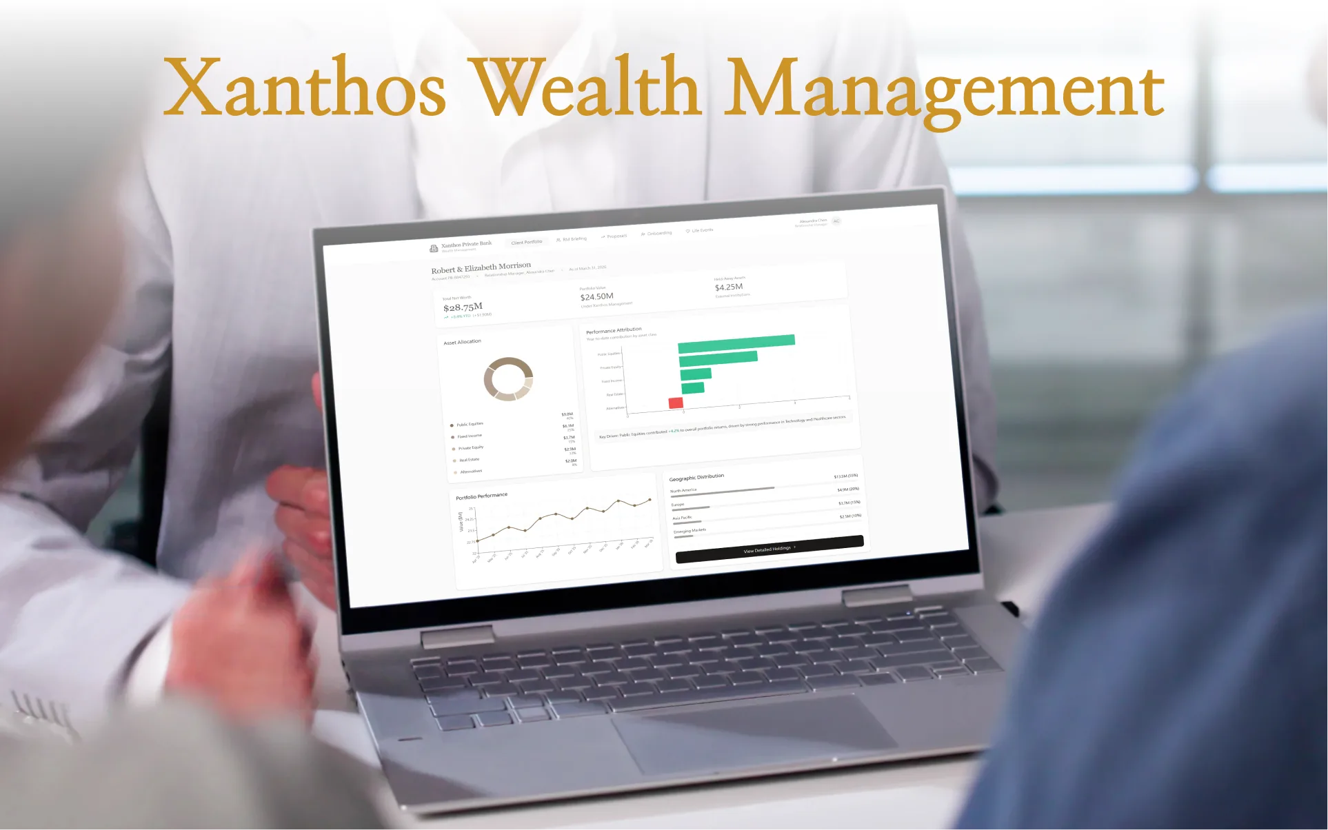
Xanthos Private Bank
Designing the B2B2C Wealth Management Experience
An exploration of eight interconnected flows for $28M+ net worth households and their relationship managers. Every design decision starts from the same premise: technology enhances the advisor-client relationship — it does not replace it.
Private Banking Has Two Users.
Most Digital Products Only Design for One.
The defining insight from my research: private banking is a B2B2C model. The Relationship Manager (RM) is the primary product user — clients experience the bank through their RM. Digital platforms that only serve the client portal half of this equation miss the point. Every design decision in Xanthos asks: does this make the RM more capable in front of the client?
| Method | Source / Sample | Key Insight That Shaped Design |
|---|---|---|
| Expert Interviews | 1 wealth management advisor (UBS background); 1 former private banking client ($15M AUM) | RMs open client profiles before every call — not during. The briefing view must be scannable in under 90 seconds. Clients never manage portfolios directly; they confirm and approve RM-driven decisions. |
| Competitor Audit | JPMorgan Private Bank portal, UBS Key4, Citi Wealth, Schwab Advisor Center (all public-facing or press screenshots) | Every competitor puts portfolio value first, RM context second. This is backwards for the actual workflow — RMs need relationship signals (upcoming events, recent activity) before financial numbers to have a meaningful client conversation. |
| Regulatory Review | FINRA suitability rules (Rule 2111), SEC Investment Advisers Act, AML/KYC onboarding requirements (FinCEN) | Suitability obligations require documenting why a client approved an investment, not just that they did. Drove the digital signature + rationale capture in the Proposal Acceptance flow. |
| UHNW UX Patterns | Christie's HNWI digital platform (direct experience); luxury brand accessibility research (Nielsen Norman Group reports) | UHNW 55+ clients are not "low-tech" — they're high-stakes and low-tolerance. Minimum 16px body text, 4.5:1 contrast ratios, and minimal modal interruptions. Accessibility here is brand standard, not accommodation. |
| Design Hypothesis | Derived from all above; not validated in production | The most important design decision is what to hide. Private banking clients are overwhelmed by choice and complexity — curation is the service. Every screen asks: "what is the one thing this person needs to do or know right now?" |
Two People. One Platform.
Every screen in Xanthos serves one of two users — sometimes both simultaneously. Understanding each user's mental model, workflow, and emotional context was the foundation of every design decision.
Robert & Elizabeth Morrison
- Confirm that wealth is growing and protected — at a glance
- Understand why the portfolio changed, not just that it did
- Trust that their RM knows their full financial picture before every call
- Navigate a major life event (business sale) without feeling overwhelmed
- Sign off on investment decisions without printing, scanning, or mailing
Alexandra Chen
- Walk into every client meeting knowing what changed since the last one
- Surface relevant talking points without reading 40 pages of reports
- Flag life events before clients bring them up — feel proactive, not reactive
- Generate and deliver investment proposals efficiently without ops team bottlenecks
- Keep a clean audit trail of client decisions for compliance
Private Banking Is Not a Trading Platform.
They Solve Opposite Problems.
Most of my production experience is in trading platforms (ACY Securities, Finlogix, LogixTrader). Before designing Xanthos, I had to explicitly map where those patterns apply — and where they would actively harm the private banking experience. This table guided every design decision.
| Dimension | Trading Platform (ACY / LogixTrader) | Private Banking (Xanthos) |
|---|---|---|
| Primary emotion | Urgency, speed, competitive edge | Calm confidence, control, trust |
| Data density | Maximum — expert users expect and want 120+ concurrent metrics | Minimum viable — every extra number is a potential anxiety trigger |
| User intent | Execute — open app to trade | Confirm — open app to verify "am I okay?" |
| Session length | Long, frequent (active traders check every few minutes) | Short, infrequent (2–4× per month, 3–5 minutes per session) |
| Who is the real product | The platform itself — traders interact with the tool directly | The RM relationship — digital tools amplify the human advisor |
| Theme / visual language | Dark mode — reduces eye strain over long sessions, signals "pro" | Light mode — legible in office settings, signals institutional trust |
| Compliance role in UX | Leverage disclosures, suitability warnings — risk communication at point of action | Fiduciary standard, AML/KYC, FINRA suitability — woven into relationship-building, not interruptions |
| Success metric for designer | Task completion speed (order execution time: 8.2s → 2.9s) | Trust, relationship depth, advisor capability — "did this make the RM look smarter?" |
What transfers from trading platform work: authenticated secure environments, regulatory disclosure patterns, information hierarchy under data density, cross-functional Legal collaboration. What doesn't transfer: dark themes, density defaults, speed-optimized interaction models.
Three Problems Worth Solving
Data Density vs. Anxiety Management
A $28M portfolio has dozens of data points. Showing all of them equally is not
information design — it is anxiety. The challenge: how do you surface portfolio health
in a single glance, while keeping full attribution depth one tap away?
Private banking clients are sophisticated but not traders. They want signal,
not noise. The design answer is strict visual hierarchy: net worth + directional arrow
first, attribution second, holdings third.
Making Compliance Feel Like Service
FINRA suitability requirements, SEC investment adviser regulations, Accredited Investor
certification, AML/KYC — onboarding a private banking client involves significant
regulatory overhead. The challenge: how do you make a legally-required process
feel like the bank is getting to know you, not interrogating you?
The answer is progressive disclosure, contextual "Why We Ask" explanations, and
sequencing steps in the order of emotional trust-building, not regulatory priority.
The RM Intelligence Gap
RMs manage 10–15 complex client relationships simultaneously. Before a client
meeting, they need to synthesize portfolio performance, market events, client
communications, and upcoming life events — typically from 4+ separate systems.
The challenge: design a single pre-meeting briefing view that surfaces what changed,
what to say, and what to watch for — in the 5 minutes before a client call, not in a
2-hour report preparation session.
Navigation Structure Is a Design Decision
The top navigation in every Xanthos screen — Client Portfolio · RM Briefing · Proposals · Onboarding · Life Events — is not arbitrary. Each tab represents a distinct user context and mental model. The ordering reflects the frequency and urgency of real private banking workflows.
Most frequent access point. Clients and RMs both land here. The "heartbeat" of the relationship.
RM-only view. Placed second because it contextualizes everything in the portfolio — always used before client calls.
Action-oriented. Appears after the context (portfolio) and intelligence (RM briefing) that motivates it.
One-time use, high importance. Placed near the end — new clients see it; existing clients rarely revisit.
Event-triggered, not session-to-session. Anchors the tail of the nav — present when needed, invisible otherwise.
Explore the Xanthos App
All eight flows are fully interactive. Built in React with shadcn/ui and recharts — open the prototype to navigate between the client dashboard, RM briefing view, investment proposal, life event planning, and onboarding flows.
Wealth at a Glance — Then at Depth
The portfolio dashboard is built around a single design principle: answer "am I okay?" before anything else. The three-stat header (Total Net Worth, Portfolio Under Management, Held Away Assets) gives clients an immediate orientation across their complete financial picture — including assets held at other institutions — before any charts appear.
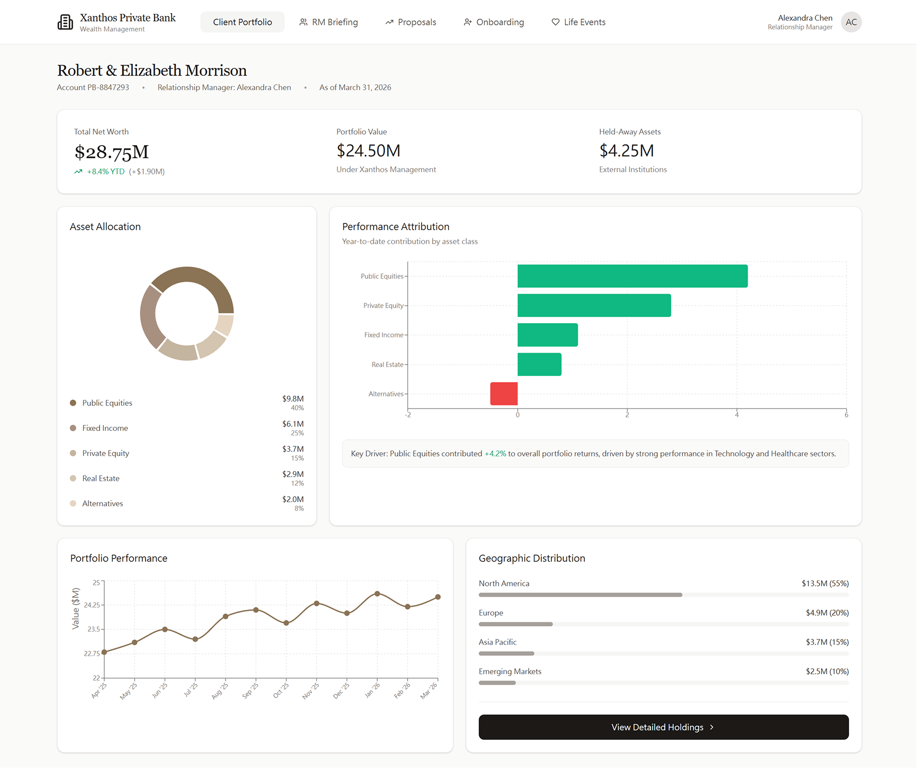
Client Portfolio Dashboard — Robert & Elizabeth Morrison · $28.75M Net Worth
Performance Attribution, Not Just Performance
The bar chart shows year-to-date contribution by asset class, not just a single portfolio return number. UHNW clients ask their RM "why did the portfolio move?" — this answers it before the call.
Held-Away Assets Surface the Full Picture
Displaying $4.25M in held-away assets (not managed by Xanthos) reflects how private banking actually works. RMs need the complete wealth picture to give holistic advice — not just the assets they manage directly.
Geographic Distribution as Risk Signal
For a globally diversified UHNW portfolio, geography is a risk dimension alongside asset class. North America concentration (55%) is a natural talking point for the RM's next meeting.
"View Detailed Holdings" Preserves Hierarchy
The dashboard intentionally withholds individual holding detail. Drilling down is a deliberate action — this prevents cognitive overload for clients who only need the summary view 80% of the time.
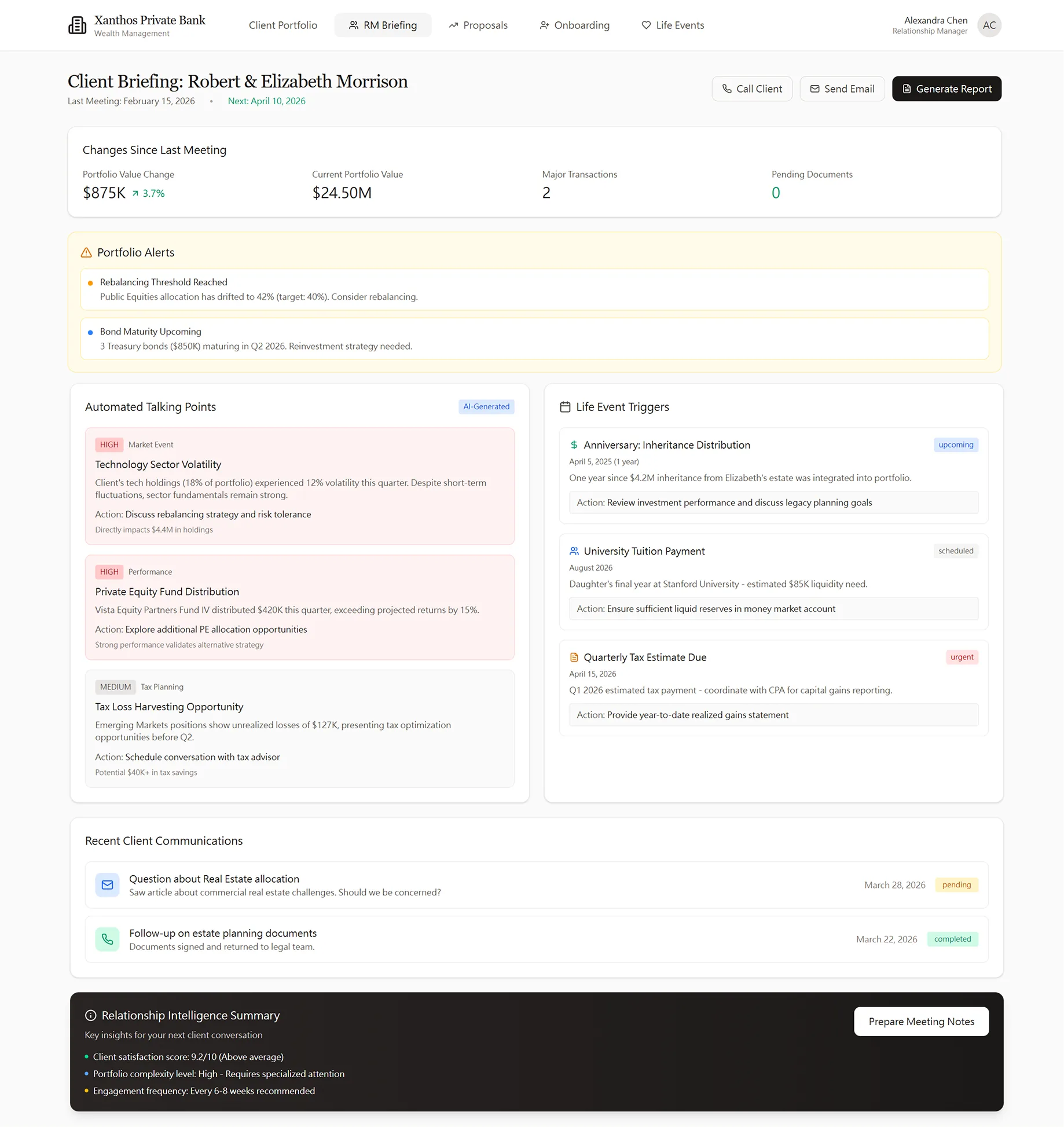
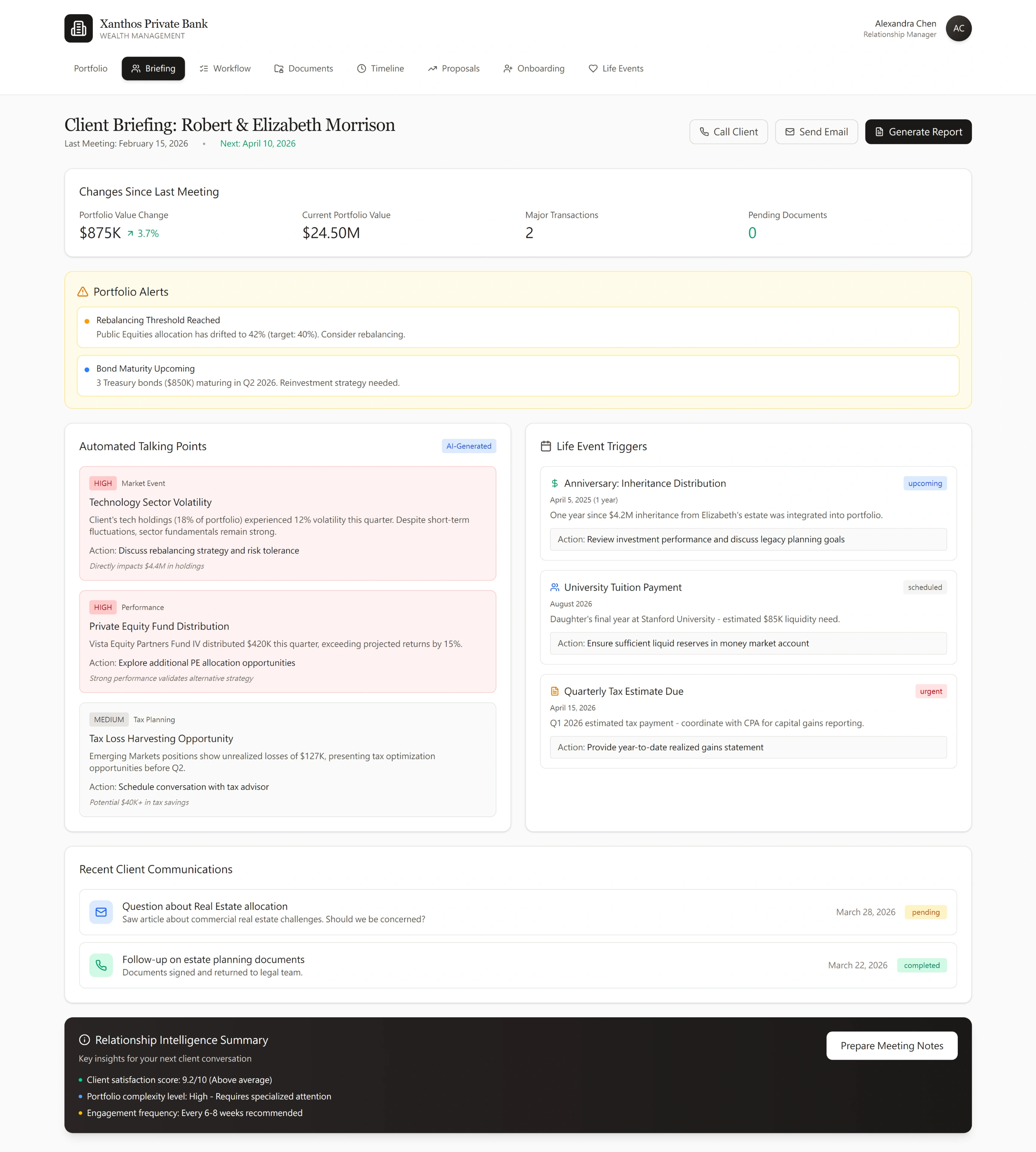
Five Minutes to Know Everything That Matters
The RM Briefing view is the highest-value screen in the product — and the one most private banking platforms don't build well. It aggregates portfolio changes, compliance alerts, market-driven talking points, and upcoming life event triggers into a single pre-meeting intelligence briefing. The RM arrives at every client touchpoint prepared, not scrambling.
RM Briefing View — Client Intelligence Dashboard Before Every Client Meeting
Changes Since Last Meeting — The First Thing RMs Need
Portfolio Value Change (+$875K, +3.7%), Current Portfolio Value, Major Transactions, and Pending Documents are surfaced immediately. The RM knows the financial delta before reading a single line of text.
Automated Talking Points — Saved by AI, Not Replaced by It
Three talking point categories (Market Event, Performance, Tax Planning) are automatically generated from portfolio data + market context. Each includes a specific action recommendation. The RM edits and uses them — AI is the draft, human is the judgment.
Life Event Triggers — Proactive, Not Reactive
Three upcoming triggers are surfaced: inheritance distribution anniversary, university tuition payment, and quarterly tax estimate. Each has an actionable recommendation. This is what separates a great RM from an average one — the tool makes every RM look like the best one.
Relationship Intelligence Summary at the Bottom
Client satisfaction score (9.1/10, above average), complexity level (high), and recommended engagement frequency — a quick reference that helps RMs prioritize which clients need attention across their full book.
Client Briefing — Full Pre-Meeting Intelligence for the Morrison Household
Portfolio Alerts Surface What Needs Action
Two active alerts are shown: a rebalancing threshold breach (Public Equities drifted to 42% vs. 40% target) and upcoming bond maturity ($850K Treasury bonds in Q2 2026). These aren't raw data — they're pre-analyzed decisions the RM needs to discuss with the client.
Life Events Drive the Relationship, Not the Portfolio
Inheritance distribution anniversary (1 year since $4.2M integration) and daughter's university tuition ($85K, August 2026) are surfaced as actionable triggers. Each carries a recommended action — "Review investment performance and discuss legacy planning goals." This is the design pattern that turns a quarterly review into a relationship milestone.
From Recommendation to Signed Commitment — In One Flow
The investment proposal screen is where design has the most to prove: it must make complex portfolio rebalancing legible to a client who is not a portfolio analyst, while satisfying fiduciary disclosure requirements and guiding them to a confident decision — without a single phone call or paper document.
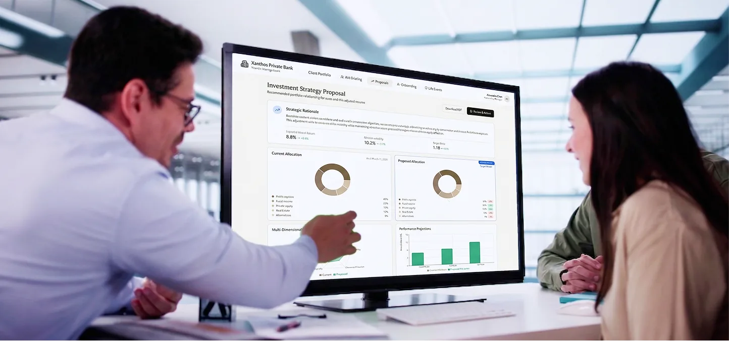
The proposal screen is designed for the RM-to-client presentation moment — readable at distance on a shared monitor
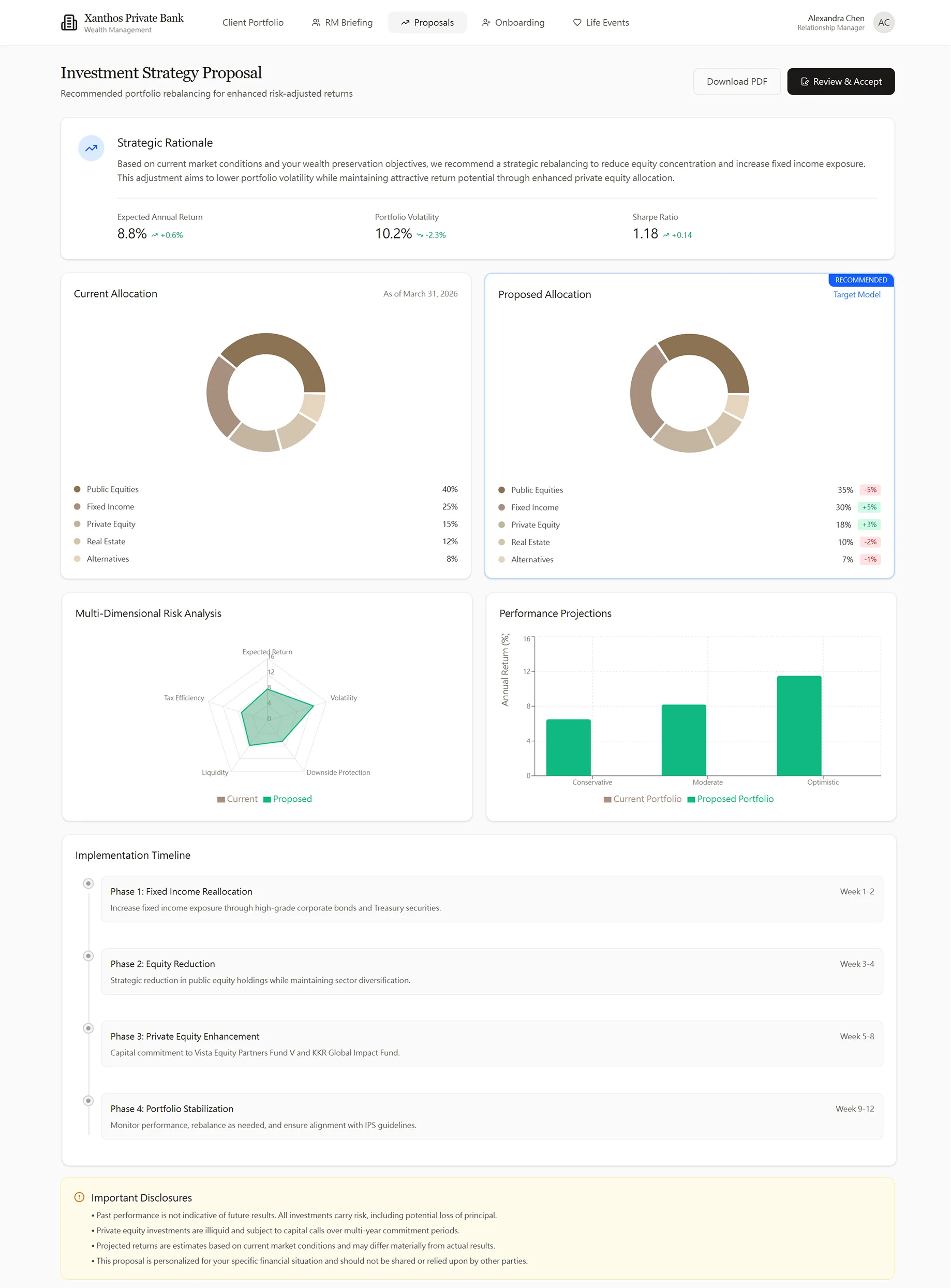
Investment Strategy Proposal — Full View

Digital Acceptance Modal — Signature & Confirmation
Before / After Allocation — Side by Side
Current and proposed allocations shown as parallel donut charts, with delta percentages called out. The client doesn't need to calculate — the change is made visual and immediately scannable.
Multi-Dimensional Risk Analysis
A spider/radar chart comparing current vs. proposed portfolio across five risk dimensions (Volatility, Liquidity, Drawdown, Diversification, Income). UHNW clients can see the full risk trade-off, not just return vs. volatility.
Implementation Timeline Makes Complexity Manageable
A rebalancing of this size happens in phases. The 4-phase timeline (Weeks 1–3, 1–4, 1–5, 6–12) reduces client anxiety by making the process legible and predictable — they know what happens and when.
Digital Acceptance — Audit Trail by Design
The acceptance modal summarizes exactly what the client is approving, renders a digital signature field, and records the date. Regulatory-grade audit trail built into the primary user action — not bolted on as an afterthought.
Wealth Is Built in Moments. Design for the Moment.
Private banking relationships are often triggered — or deepened — by a major life event: a business sale, inheritance, retirement, or a child's education. This module treats those moments as structured design contexts, not generic "financial planning" screens. Each event type has its own emotional register, data model, and decision architecture.
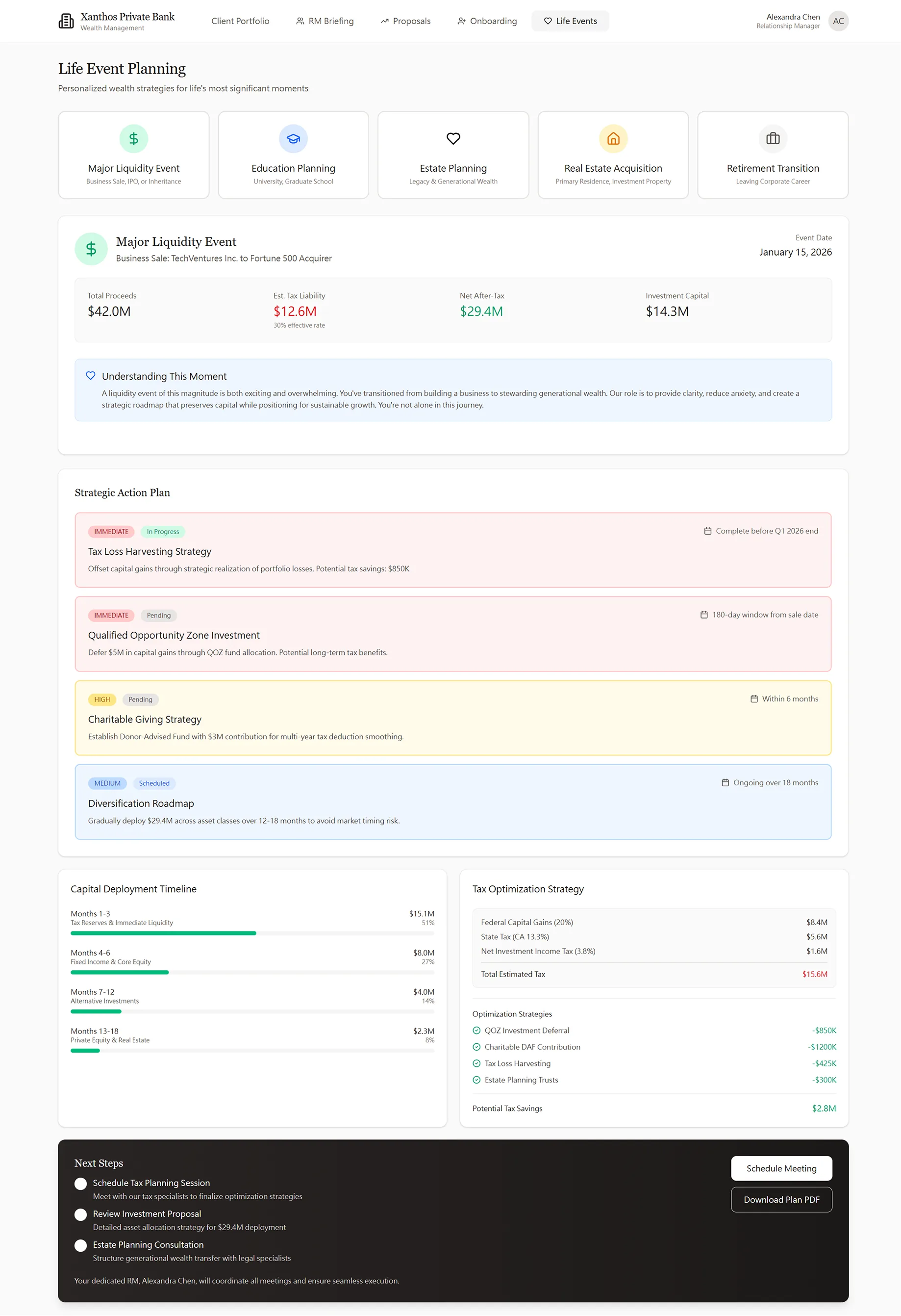
Life Event Planning — Major Liquidity Event: Business Sale $42M Proceeds
Event Tabs as Design Contexts
Major Liquidity Event, Education Planning, Estate Planning, Real Estate Acquisition, and Retirement Transition are not just categories — each has completely different data needs, timelines, and emotional stakes. The tab structure enforces context-appropriate design, not a generic form.
"Understanding This Moment" — Empathy Before Data
Before any numbers, a brief narrative acknowledges the emotional dimension of the event. A business sale is 12 years of work crystallizing into liquidity. Naming that context earns trust before the tax liability figure lands.
Capital Deployment Timeline Is the Anxiety Reducer
$14.3M of investable capital feels overwhelming without a plan. Breaking it into a month-by-month deployment schedule (Month 1, Month 1–3, Month 1–6) converts a lump sum into a manageable sequence of decisions.
Next Steps Are Meetings, Not Features
The module closes with "Schedule Tax Planning Session," "Schedule Investment Proposal," and "Estate Planning Consultation." Actions lead back to the RM relationship — the product's job is to make the conversation richer, not to replace it.
A Complex Legal Process That Feels Like a Conversation
UHNW onboarding involves: FINRA suitability assessment, Source of Wealth documentation (AML requirement), account entity structuring (trust, LLC, family office), Investment Policy Statement creation, and Accredited Investor certification. In a traditional private banking context, this is a 6-week paper-based process.
The design principle: sequence steps in the order of emotional trust-building, not regulatory priority. Client Information first (who you are), Source of Wealth second (where it came from), Entity Structure third (how you hold it), Investment Policy fourth (what you want), Compliance last (what the law requires). Regulations are met in full — they're just not front-loaded as an interrogation.


Key Onboarding Design Decision: Conditional Complexity
The entity structure step is where most private banking onboarding forms break down — they show all possible fields for all possible entity types simultaneously. In Xanthos, selecting "Family Office / LLC" progressively reveals the additional fields (Entity Legal Name, Tax ID). Clients who choose "Individual / Joint Account" never see those fields. The same regulatory data is collected — but only when relevant. This pattern mirrors my KYC work at ACY: required disclosures at the point of need, not front-loaded as a wall of form fields that drives abandonment.
Every Layer of Client Intelligence, One Screen
Below the delta summary and portfolio alerts, the briefing surfaces three more intelligence layers: AI-generated talking points tied to live market events, life event triggers with actionable recommendations, and a communication log that shows what's been said — and what hasn't been resolved. The Relationship Intelligence Summary at the bottom tells the RM exactly how to prioritise this client in their weekly book.
RM Briefing — Portfolio Alerts, Automated Talking Points, Life Event Triggers, and Relationship Intelligence
Portfolio Alerts Are Pre-Analysed Decisions
Two alerts: Public Equities drifted to 42% (target 40%) and $850K Treasury bonds maturing Q2 2026. Neither is raw data — both carry a specific recommended action. The RM arrives knowing what to discuss, not what to investigate.
Three Talking Points, Three Categories
Market Event (Technology Sector Volatility), Performance (Private Equity Fund Distribution projected +13%), and Tax/Planning (Tax Loss Harvesting — $137K unrealised loss in Emerging Markets). Each ends with an explicit action. AI drafts; the RM judges.
Life Event Triggers Surface Before They Become Urgent
Inheritance distribution anniversary (1-year review), university tuition payment ($85K Stanford, unaddressed), and quarterly tax estimate due (urgent — coordinate with CPA). These aren't calendar reminders — each carries a recommended advisory action.
Relationship Intelligence Summary
Satisfaction score 9.4/10 (above average), portfolio complexity high (requires specialised attention), engagement frequency every 8 weeks recommended. One glance tells the RM where this client ranks across their full book of relationships.
Task Management That Reflects How RMs Actually Work
Every task is attached to a client, an AUM value, and a deadline — because an RM's effectiveness isn't measured in tasks completed, it's measured in AUM retained and grown. The Workflow Center puts pipeline value ($125M), client satisfaction (9.4), and deadline urgency side-by-side. Compliance deadlines, portfolio reviews, and new-client onboarding share the same priority framework.
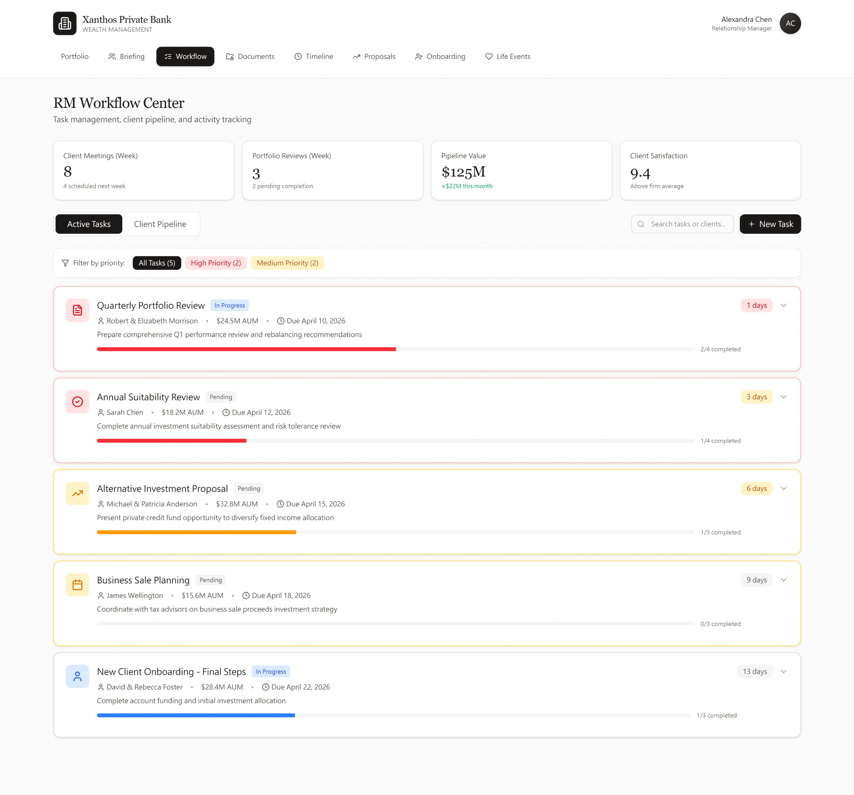
RM Workflow Center — Pipeline KPIs and Prioritised Task List with Client AUM Context
Pipeline Value as a First-Class Metric
$125M pipeline value sits alongside task count and satisfaction score — because the +$22M monthly delta directly signals whether the RM's activity is translating into business results. Generic to-do apps don't have this; Xanthos was designed for it from the start.
Urgency Is Visual, Not Just Numerical
Red "1 day" and amber "3 day" deadline badges, combined with coloured progress bars, let the RM scan their entire book in seconds. The system sorts by compliance risk, not alphabetical order — Quarterly Portfolio Review surfaces above New Client Onboarding because a missed review has regulatory consequences.
Client Context on Every Task Row
Each task shows the client name and their AUM value without requiring a click. The RM never works in the abstract — Morrison ($24.5M, 1 day) and Sarah Chen ($18.2M, 3 days) are visible at a glance. "View Client Profile" bridges the workflow to the full briefing when preparation depth is needed.
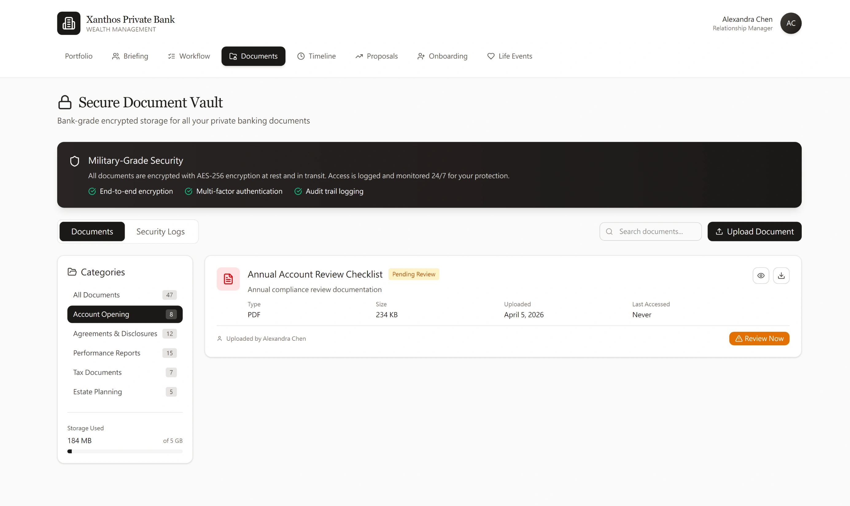
Bank-Grade Security That Clients Can See and Trust
Document management in private banking is a fiduciary obligation — IPS amendments, tax returns, estate plans all require AES-256 encryption and full audit trails. The design challenge is making bank-grade security feel accessible without hiding it. Six document categories mirror how UHNW clients think about their paperwork, not how the bank's internal filing system works.
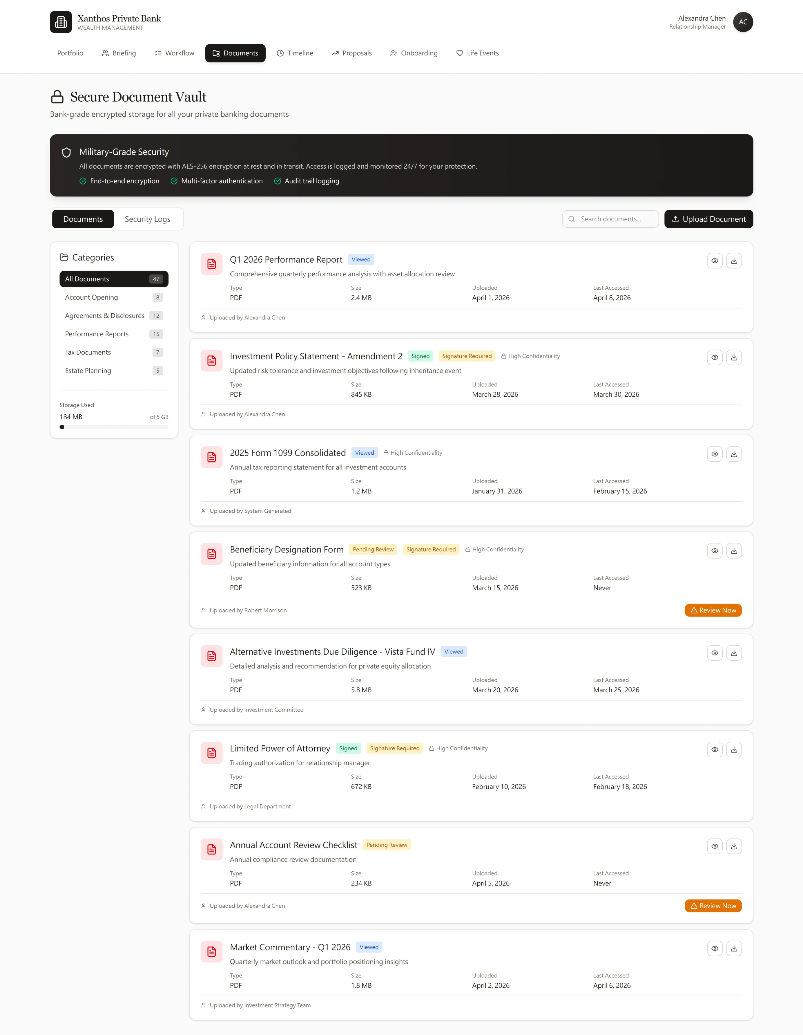
Document Vault — All Documents View with Security Status, Confidentiality Badges, and Category Navigation
Security Is the First Thing Clients See
The dark security banner — AES-256 encryption, MFA, audit trail logging — is the visual hierarchy's first element. UHNW clients sharing tax returns and trust agreements need that assurance before they upload anything. The security isn't buried in a footer or a settings panel.
Status Badges Eliminate the "Did You Sign It?" Call
Viewed, Signed, Signature Required, Pending Review, and High Confidentiality badges make document state scannable in one pass. The IPS Amendment 2 shows both "Signed" and "Signature Required" simultaneously — the RM has signed, the client hasn't. That dual-state badge prevents entire phone calls.
Category Filter: Account Opening — Compliance Review Checklist Awaiting Client Signature
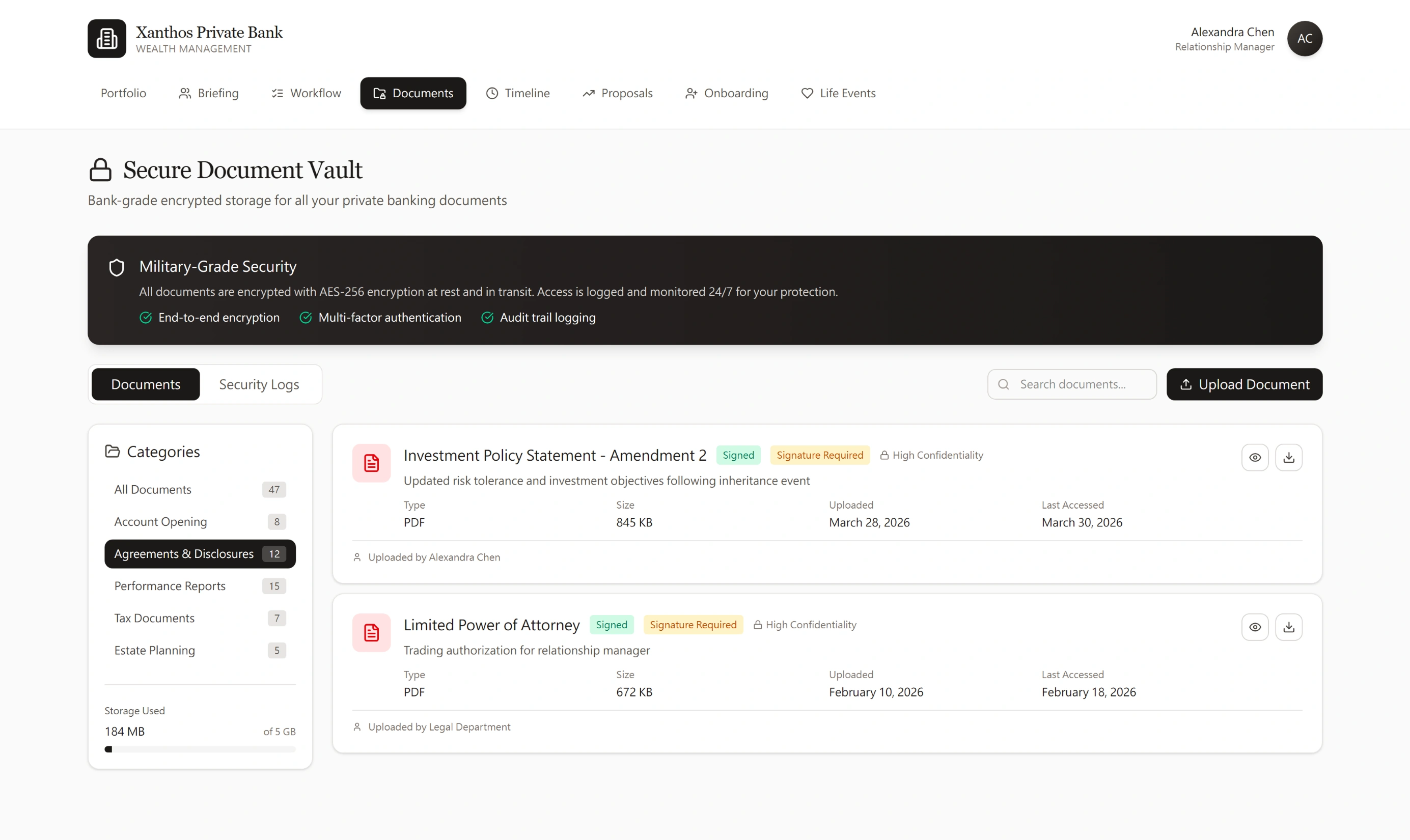
Category Filter: Agreements & Disclosures — IPS Amendment and Power of Attorney with Dual-Party Signature Status
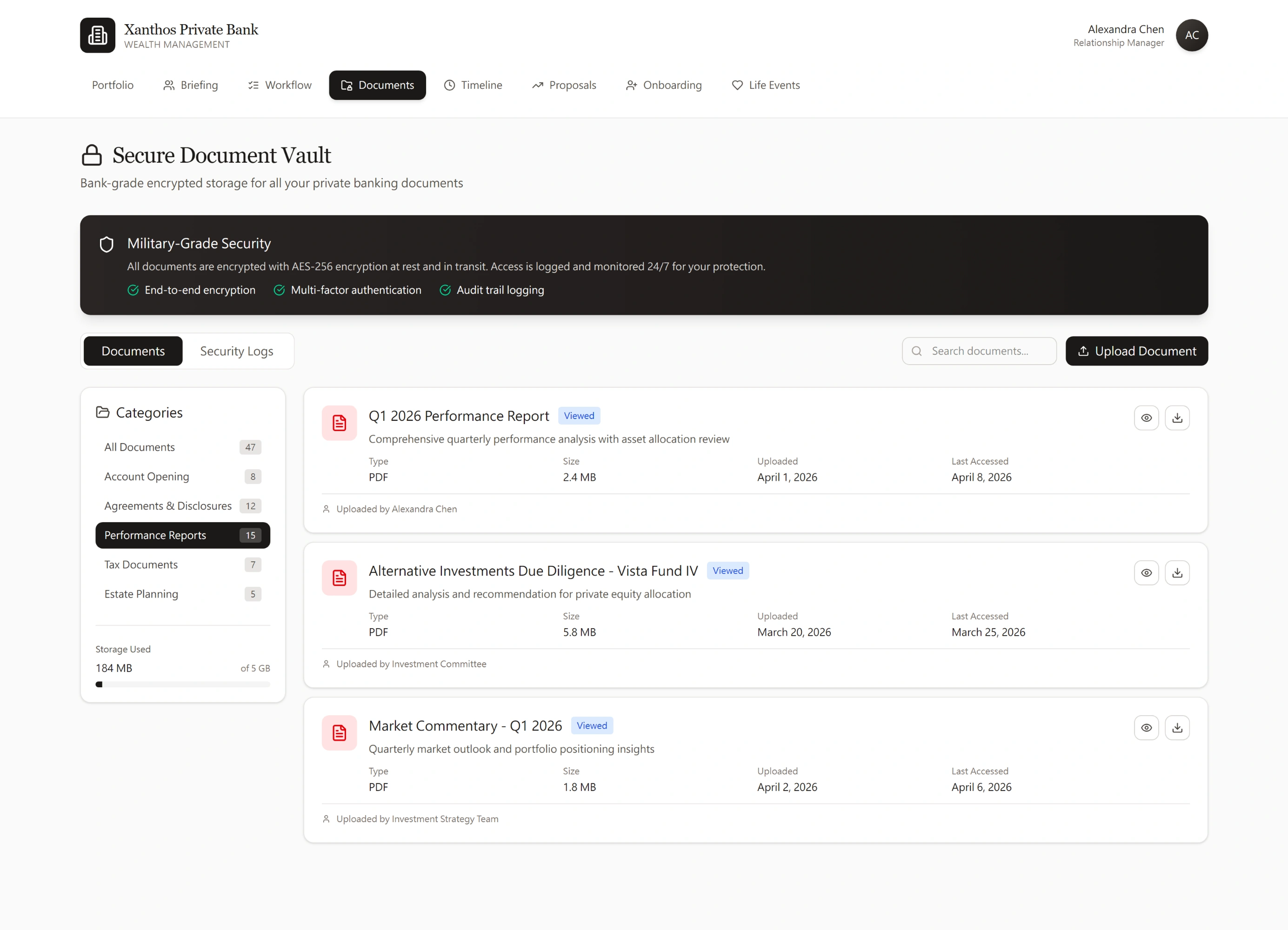
Category Filter: Performance Reports — Attribution by Source (RM, Investment Committee, Strategy Team)

Category Filter: Tax Documents — System-Generated 1099 with High Confidentiality Flag

Category Filter: Estate Planning — Client-Uploaded Beneficiary Form Pending RM Review
Categories Reflect the Client's Mental Model
Account Opening, Agreements, Performance Reports, Tax Documents, Estate Planning — these mirror how UHNW clients categorise their financial life, not how the bank's document management system is structured internally. Upload attribution (RM, Legal Department, Investment Committee, System Generated, Client) tells the RM who produced each document without opening it.
Action-Required Items Surface Automatically
The Beneficiary Designation Form was uploaded by Robert Morrison — the client took initiative. The "Review Now" CTA makes the required RM action unambiguous. In a vault with 47 documents, nothing requiring action gets buried in a date-sorted list.
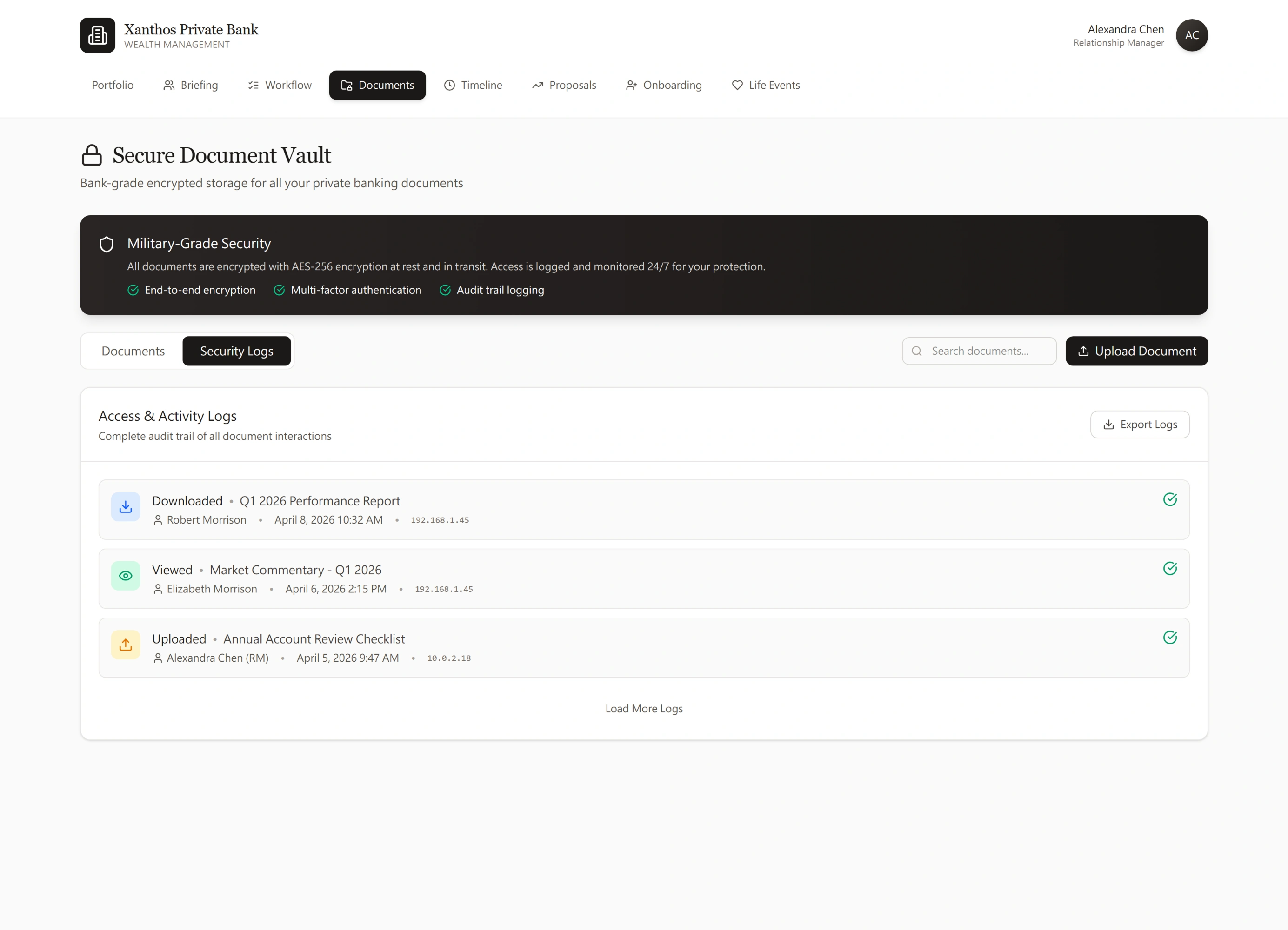
Security Logs — Full Audit Trail with IP Tracking and One-Click Export for Compliance Reviews
Audit Trails Are a Design Feature, Not Just Compliance
Security Logs serve two purposes: SEC record-keeping requirements, and client trust ("I can see that only my RM accessed my tax return"). The Export Logs button supports both compliance reviews and direct client requests for access history — a capability UHNW clients increasingly ask for.
IP-Level Visibility Without Technical Complexity
Each log entry shows the actor (name + role), action type, document name, timestamp, and IP address. The IP is visible to the RM but not surfaced to clients in their default view — appropriate information architecture for a regulated, multi-party document environment.
Why Document Vault Design Signals Institutional Readiness
Most private banking document portals are rebranded consumer file-sharing tools — they handle uploads and downloads but nothing about the workflow of review, signature, and audit. The Xanthos vault treats documents as workflow objects: every document has a status, an owner, an action, and an audit trail. That's the architecture institutional compliance teams require, and the UX UHNW clients expect.
The Complete Story of a Client Relationship — Chronologically
A UHNW relationship spans years: life events, investment decisions, compliance reviews, capital calls. The Advisory Timeline aggregates all of it into a single chronological narrative, filterable by event type. When a new RM inherits a client book, this is the first screen they read — the full context they need before the first meeting, without weeks of digging through CRM notes.
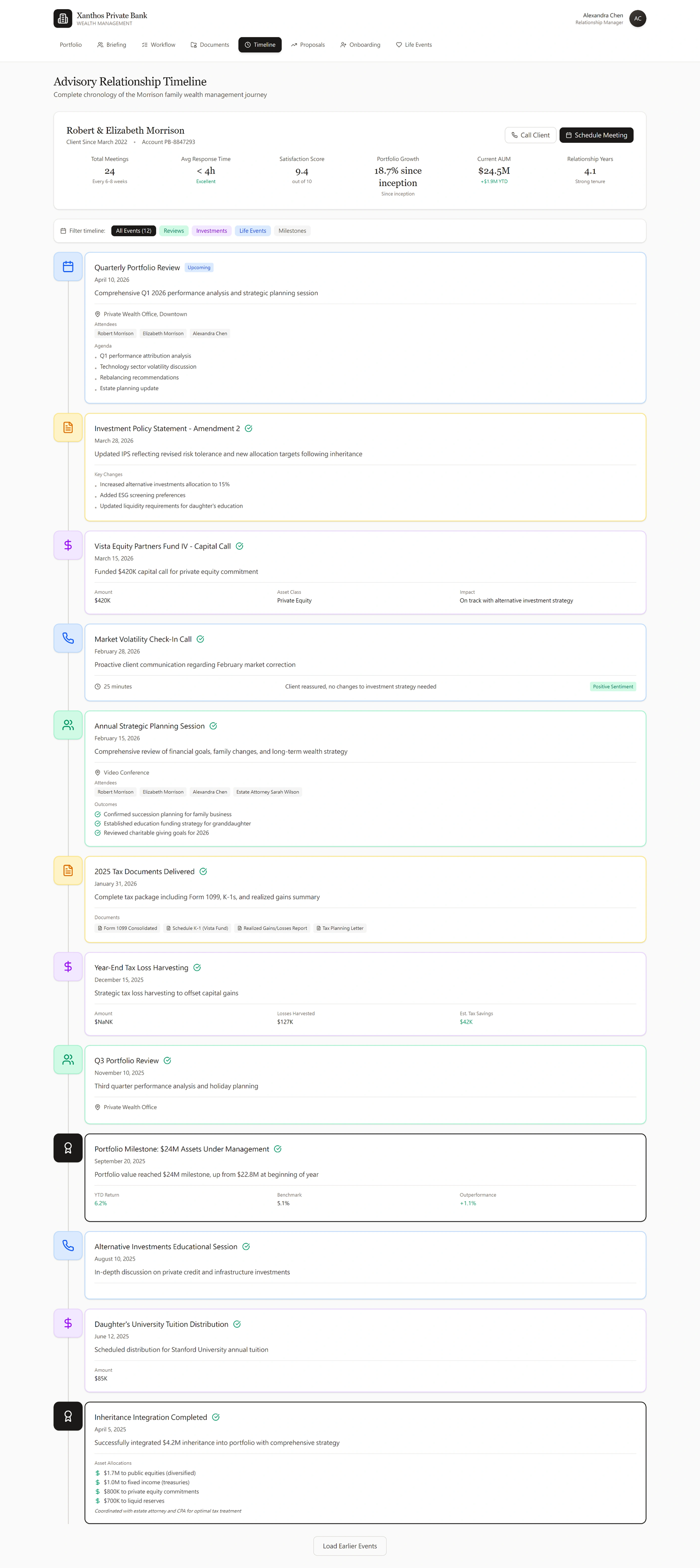
Advisory Timeline — Full Relationship History Across All Event Types

Timeline: Reviews Filter — Relationship KPIs and Upcoming Quarterly Portfolio Review with Full Agenda
Six KPIs Define Relationship Health
Meeting frequency (24 total, every 6–8 weeks), response time (<4h, Excellent), satisfaction (9.4/10), portfolio growth (18.7% since inception), AUM ($24.5M), and tenure (4.1 years, Strong). These are the signals a branch manager uses to assess whether a relationship is healthy or at risk of attrition — surfaced before opening a single document.
Five Filter Lenses, Same Underlying Data
Reviews, Investments, Life Events, Milestones, All Events (12). A compliance officer sees review cadence. An RM preparing for a meeting filters to Life Events to refresh on family context. The same timeline serves every stakeholder without requiring separate reports.
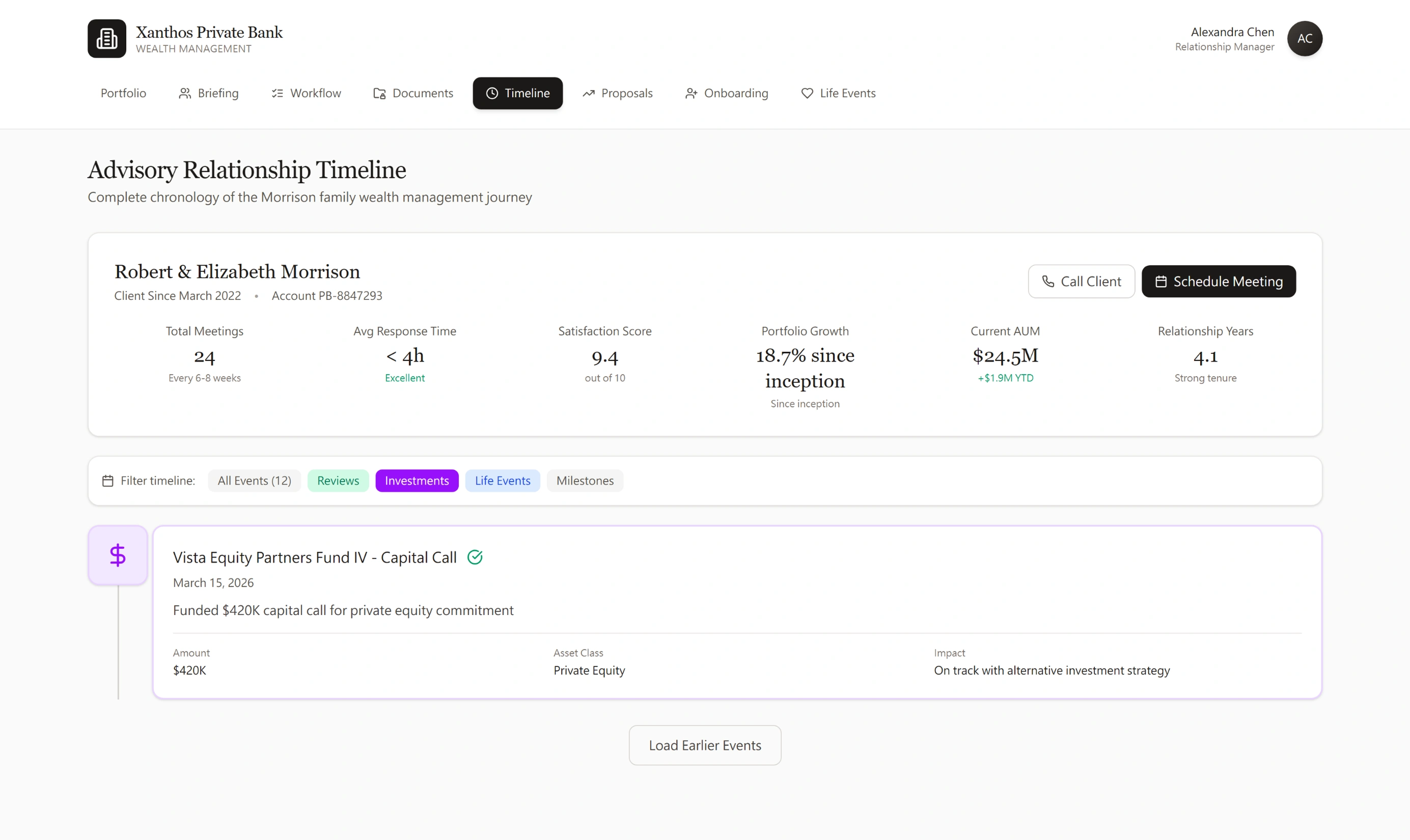
Timeline: Investments Filter — Capital Call with Amount, Asset Class, and Portfolio Impact
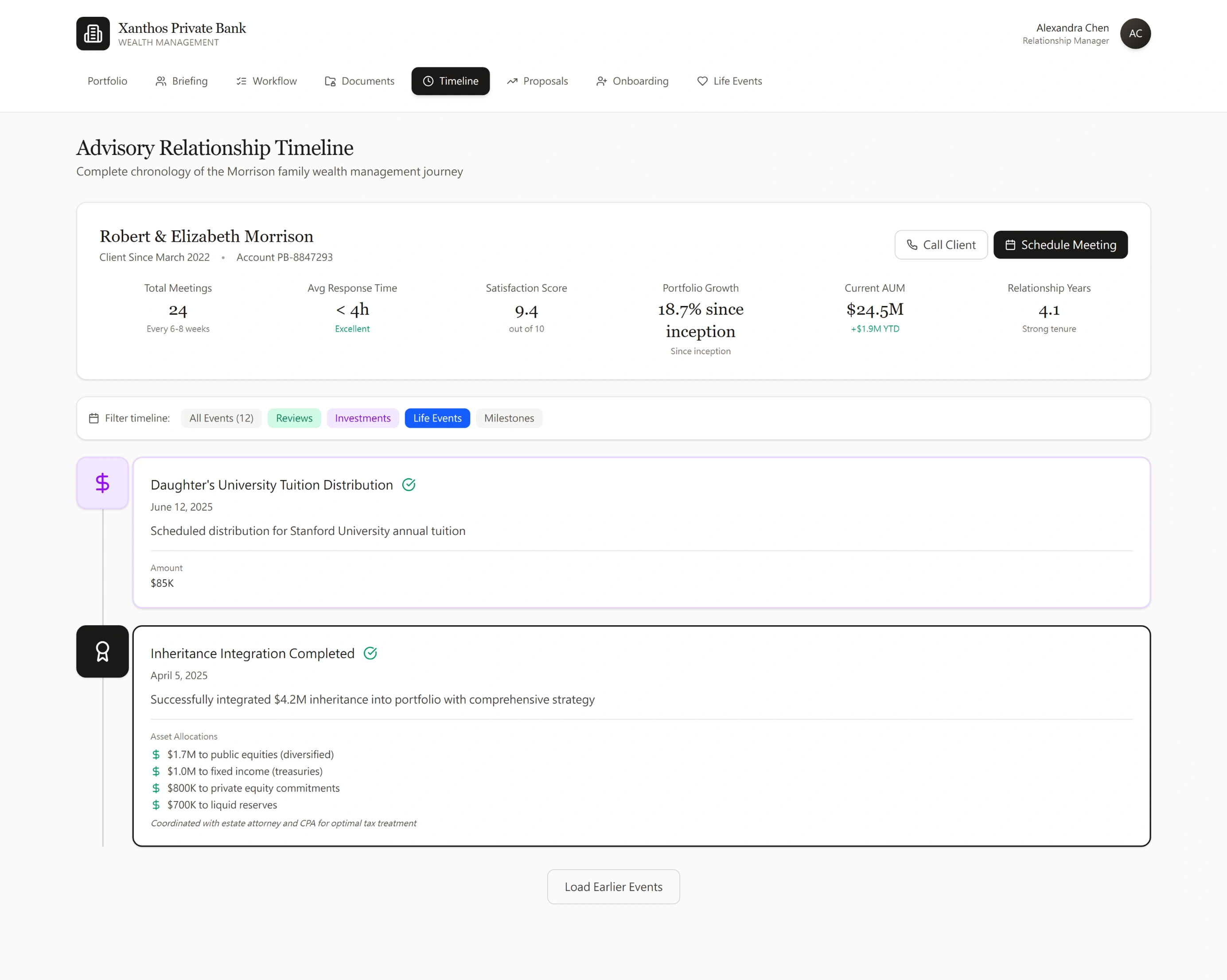
Timeline: Life Events Filter — Tuition Distribution and $4.2M Inheritance Integration with Full Allocation Breakdown
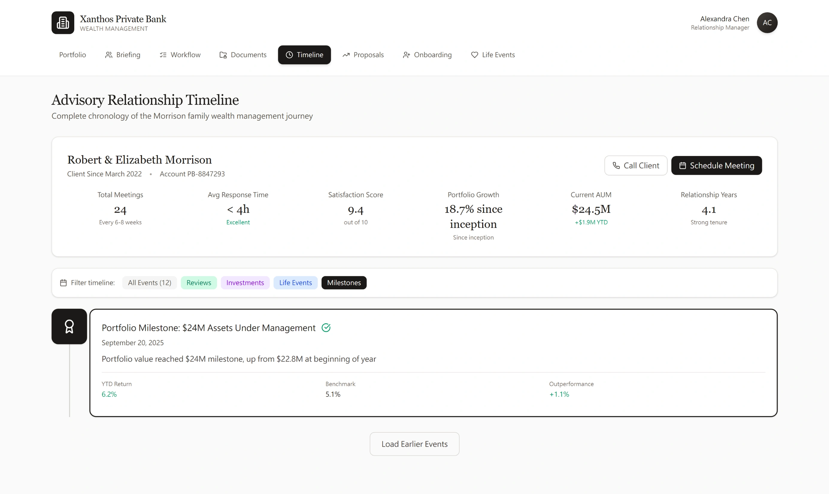
Timeline: Milestones Filter — $24M AUM Milestone with YTD Return vs. Benchmark Attribution
Every Event Type Has a Distinct Visual Language
Calendar icons for meetings, dollar icons for capital calls and distributions, person icons for life events, milestone icons for AUM achievements. An RM scrolling through four years of history spots patterns immediately — not because they're trained to use the system, but because the information architecture is self-explaining.
Life Events Carry the Relationship Context That Dashboards Can't
The $4.2M inheritance integration shows the full allocation breakdown and notes coordination with estate attorney and CPA. The tuition distribution shows $85K and the specific institution. A new RM reading this timeline understands the family's financial life — priorities, advisors, liquidity needs — before the first meeting.
Performance in Context, Not in Isolation
The $24M AUM milestone shows YTD return (6.2%), benchmark (5.1%), and outperformance (+1.1%) in the same event card as the milestone itself. That's the story a timeline tells that a dashboard metric cannot — the number in context of the relationship journey that produced it.
Why the Advisory Timeline Is the Anti-CRM
Most banks rely on scattered CRM notes — unstructured text that a new RM spends weeks parsing. RM turnover is expensive precisely because client context walks out the door with the departing RM. The Advisory Timeline structures every interaction chronologically, with event types, outcomes, amounts, and participants recorded as structured data. A new RM reads the Morrison timeline and immediately knows: the family inherited $4.2M last year, they're paying $85K/year for Stanford, they prefer video conferences, they stay calm during market corrections, and their estate attorney is Sarah Wilson. That's institutional memory — portable, searchable, and designed to survive RM turnover.
What I Chose and Why
-
Light theme, not dark
Private banking clients are often 50+ years old and use the portal in well-lit office settings. Light mode is more legible, more familiar, and signals institutional trust — not speculative fintech. The design deliberately avoids the dark dashboard aesthetic that reads as "trading app."
-
RM identity is always visible in the client portal
Alexandra Chen (Relationship Manager) appears in the top-right corner of every client-facing screen. This is intentional: the digital product exists within a human relationship, not instead of one. Every screen quietly reinforces: you have a person who manages this for you.
-
Summary first, detail on demand — everywhere
Every section follows the same information hierarchy: headline metric → directional signal → attribution → drill-down. No screen forces the client to process detail before they've oriented. "View Detailed Holdings" is always available but never the first thing shown.
-
Every regulatory disclosure has a plain-language explanation
The "Why We Ask" pattern appears throughout onboarding: Source of Wealth (AML requirement), PEP Declaration (regulatory obligation), document requirements. UHNW clients are sophisticated — they deserve to know why they're being asked, not just what they're being asked. This builds trust faster than hiding the regulatory rationale.
-
Every flow ends with a human action, not a digital one
Onboarding ends with "Your RM will call within 24–48 hours." Life events end with "Schedule a Tax Planning Session." Investment proposals end with a signature, not a dashboard. The product's role is to prepare, inform, and facilitate — never to be the final relationship the client has with the bank.
-
Accessibility as a UHNW design requirement, not an afterthought
The primary UHNW client demographic skews 55+. This has concrete design implications: minimum 16px body type (not 12px "compact" defaults), 4.5:1 contrast ratio on all data values, generous tap targets for touch use on tablets, and no reliance on color alone to communicate portfolio direction (directional arrows paired with color). WCAG 2.1 AA compliance is not just an ethical standard — it is a direct user need for this specific audience.
-
Session timeout and re-authentication handled gracefully
Authenticated financial portals require session management. For UHNW clients who may step away mid-review, a harsh logout with lost context creates anxiety at exactly the wrong moment. The design preserves in-progress state (e.g., onboarding "Save Progress" on every step), and re-auth returns the user to exactly where they left off — not to the home screen.
What I Considered and Why I Didn't Build It
A design direction is only credible if the designer can articulate what they ruled out. The following were real candidates during ideation — each had genuine merit in a different context.
Explored dark-mode variants in early exploration because they signal "premium fintech." Rejected because: (1) primary client demographic skews 55+ and uses the portal in well-lit office environments; (2) dark mode creates contrast problems in printed portfolio reports, which wealth management clients frequently request; (3) the dark aesthetic communicates trading speed rather than custodial stewardship — the wrong emotional register for relationship banking.
Considered building a Bloomberg-style live-price dashboard with real-time P&L ticking. Rejected after reviewing how UBS, Credit Suisse, and Julius Baer's client portals actually work: UHNW clients are reviewed monthly or quarterly, not hourly. Constant ticking P&L creates anxiety for long-term allocators and undermines the "wealth stewardship" framing. The design intentionally shows end-of-day values with directional context — not real-time noise.
Early wireframes included a product catalogue where clients could browse and initiate investment positions independently. Removed after considering (1) MiFID II / ASIC suitability obligations — unadvised execution for complex structured products creates regulatory liability; (2) the RM relationship model: the bank's competitive advantage is advice, not execution speed. Replacing the RM with a browse-and-click flow destroys the product's positioning. All investment initiation flows route through RM confirmation.
Considered a single paginated scroll (common in modern consumer SaaS onboarding) to reduce navigation overhead. Rejected because: (1) UHNW onboarding requires 60–90 minutes and multiple document uploads — forcing this into a single session creates abandonment risk; (2) the 5-step model with "Save Progress" on each step allows clients to complete onboarding over multiple sessions, which matches actual behavior; (3) discrete steps create clear audit checkpoints for the compliance team reviewing KYC completeness.
Notification systems were scoped in early planning. Removed from MVP scope because: (1) unsolicited price alerts to retail clients are regulated communication in multiple jurisdictions (FCA COBS, MiFID II Article 24); (2) for a concept without a defined legal entity, specifying notification architecture before regulatory review would have been a design fiction; (3) the RM calling model is a more appropriate escalation path for UHNW clients. This is noted as a future validation item rather than a current feature.
What I'd Validate Before Building
These are the open questions I'd bring to usability research with real UHNW clients and RMs before committing to this design direction:
- Does the "held-away assets" panel cause confusion about what Xanthos manages vs. what it just tracks?
- Do RMs actually want AI-generated talking points, or do they feel it undermines their expertise and judgment?
- Is the multi-dimensional risk spider chart legible to clients without a finance background, or does it create anxiety?
- Does the life event tab structure match how clients mentally categorize their financial inflection points?
- At what entity complexity level does the conditional onboarding disclosure break — what's the edge case for a client with multiple trusts and LLCs?
- Mobile: which flows do UHNW clients access on phone vs. tablet vs. desktop, and does the information hierarchy need to change accordingly?
Direct Foundations From Production Work
Private banking is a new context for me. The design thinking is not.
UHNW Client Psychology
Designing for $5M–$80M property buyers taught me the same trust model that drives private banking: high-stakes decisions require relationship-first digital design. The product's job is to make the advisor look better, not to replace them. Every Xanthos UX decision reflects this.
Advisor-Facing Workflow UX
Built an advisor-facing CRM managing 100K+ client accounts with role-based access controls, compliance audit trails, and scalable onboarding. The RM Briefing view is a direct evolution of this pattern — same design challenge, higher-value context.
Compliance-as-UX Design
Designed multi-step KYC flows under ASIC/FCA/FINRA regulation — turning 47-field disclosure requirements into a tabbed architecture with 73% drop-off reduction. The Xanthos onboarding applies the same constraint-first thinking to a more complex UHNW context.
Domain Fluency for Wealth Management
Completed Yale's Financial Markets course to understand portfolio theory, risk models, and regulatory rationale — not as academic background, but as design input. Concepts like performance attribution, Sharpe ratio, and drawdown are UX terms in Xanthos, not financial jargon added as decoration.
How Xanthos Speaks to What Private Banking Teams Need
Private banking digital roles ask for things that are easy to claim and hard to prove. This table maps specific design decisions in Xanthos to the capabilities they demonstrate.